Dark Patterns & Weaponized Hierarchy
Every technique you learned in Parts 1-3 can be weaponized against the user. We break down Dark Patterns, how hierarchy is used to deceive, and the exact language you need to push back against unethical requests.
The Roach Motel Simulator
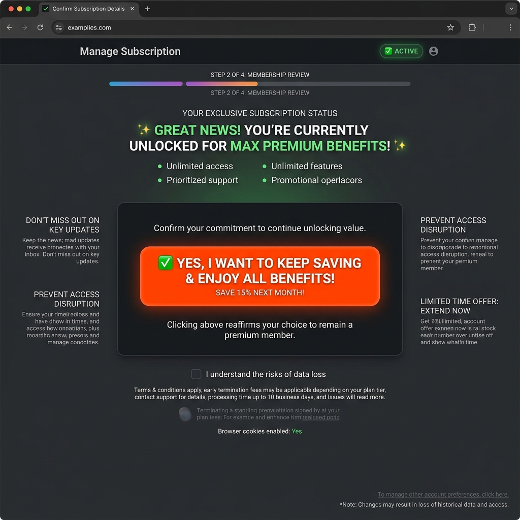
A "Roach Motel" is easy to get into (Subscribe) and mathematically impossible to get out of (Unsubscribe). Use the sliders to weaponize the hierarchy and trap the user.
🪤 Subscription Cancellation Flow
The Misdirection Simulator
Misdirection forces the user's eye toward the action that benefits the company, while mathematically camouflaging the action that benefits the user.
🍪 Cookie Consent Flow
Real-World Deception: Before & After
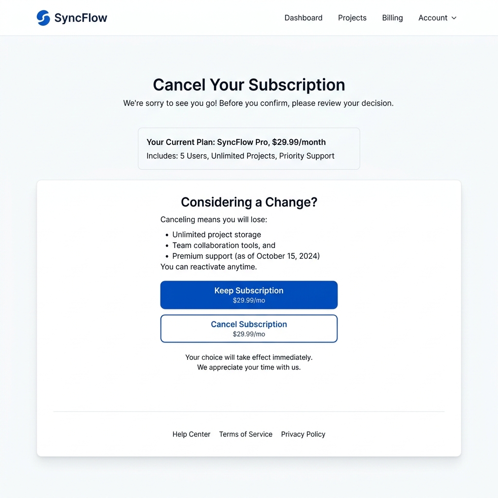
Can you spot the difference between Persuasion and Deception? The left side manipulates hierarchy to trap the user. The right side respects their choice.
Hall of Shame
Top Mistakes Designers Repeat Forever.
- #1 Hiding the 'Decline' button in low-contrast gray text.
- #2 Treating "A/B Test Win" as moral justification for deception.
- #3 Forgetting that symmetric friction is required for trust.
- #4 Letting the PM dictate the layout hierarchy without pushback.
The Designer's First Question
Before touching any tool, ask: "What changed?" or "Was this file ever correct?"
Hierarchy Troubleshooting Tree
Is the user doing the wrong thing?
│
├── Are they clicking the wrong button?
│   ├── YES: Check Contrast & Scale. Is the secondary action heavier?
│   └── NO: Move to Flow.
│
├── Are they missing the legal text?
│   ├── YES: Check Saccadic Masking. Is it hidden between eye jumps?
│   └── NO: Check Cognitive Load. Is the page too cluttered?
│
└── Are they complaining about feeling trapped?
    └── YES: You built a Roach Motel. Add symmetrical friction.
The Dark Pattern Severity Matrix
Not all persuasion is a dark pattern — there is a line, and a designer's job is to know exactly where it sits. These four tiers run from honest emphasis to legal liability. Find the tier, and you know what to do.
Cosmetic Persuasion
Honest emphasis on a real benefit. Nothing is hidden; the user can see every option and still choose freely.
Manipulative Nudge
A thumb on the scale. The other choice still exists and is findable, but psychology is being used to tilt the decision.
Deceptive Pattern
The choice is hidden, disguised or obstructed — the option is taken away, not just nudged. This is manipulation, not persuasion.
Legal Risk
Deception that crosses into regulated territory — consent, billing or disclosure law. The company, and sometimes you, can be fined.
Glossary — the 12 patterns of deception
Roach Motel
- Definition
- A design that makes it extremely easy to get into a situation (like a subscription) but mathematically impossible to get out.
- Why Designers Care
- It weaponizes contrast and whitespace against the user, causing immense brand damage.
- Failure Signature
- • 12-step cancellation flows
• Hidden "Continue to Cancel" links
• Support says: "Users feel trapped"
Misdirection
- Definition
- Using hierarchy to focus attention on one thing to distract from another.
- Why Designers Care
- A massive, glowing 'Accept All' button forces the user's eye away from the tiny gray 'Manage Settings' link.
- Failure Signature
- • One massive primary button
• Secondary button looks like unclickable body text
Confirmshaming
- Definition
- Guilt-tripping the user into opting in by making the decline option sound shameful.
- Why Designers Care
- It replaces a neutral UI action with emotional manipulation.
- Failure Signature
- • "No thanks, I prefer to stay poor"
• "I don't care about my health"
• Client says: "Let's make it punchy"
Saccadic Masking
- Definition
- The brain's failure to process details during rapid eye movements between focal points.
- Why Designers Care
- Dark patterns place critical terms inside the "jump" between a giant headline and a giant button.
- Failure Signature
- • Users checking out without realizing it's a subscription
• Legal text floating in no-man's-land
False Urgency
- Definition
- Adding fake countdown timers or "Only 1 left!" badges to force immediate action.
- Why Designers Care
- It artificially increases cognitive load and anxiety, bypassing rational decision-making.
- Failure Signature
- • Blinking red countdowns that reset on refresh
• "14 people are looking at this right now"
Disguised Ads
- Definition
- Adverts designed to perfectly mimic the surrounding organic content or UI navigation.
- Why Designers Care
- It breaks the foundational rule of "Figure-Ground" by deliberately confusing the layers.
- Failure Signature
- • Clicking a "Download" button that actually installs malware
• Native ads that look exactly like news articles
Forced Continuity
- Definition
- When a free trial silently converts to a paid subscription without adequate warning.
- Why Designers Care
- The hierarchy of the billing date is intentionally minimized to ensure the user forgets.
- Failure Signature
- • Credit card required for a "free" trial
• No reminder email before charge hits
Bait and Switch
- Definition
- When the user performs an action expecting one result, but a different, undesirable result occurs.
- Why Designers Care
- It destroys the psychological contract of interaction design.
- Failure Signature
- • Clicking 'X' installs the app instead of closing the window
• "Free Check" leads to a paywall to see results
Trick Questions
- Definition
- Using double negatives or confusing checkboxes to trick users into opting in.
- Why Designers Care
- It exploits the user's scanning behavior by making the text deliberately hard to parse.
- Failure Signature
- • "Uncheck this box if you don't want to not receive emails"
• Checkbox A opts you in, Checkbox B opts you out
Sneak into Basket
- Definition
- Automatically adding additional items to the user's cart without explicit consent.
- Why Designers Care
- It relies on the user not checking the subtotal before clicking the massive checkout button.
- Failure Signature
- • Travel insurance auto-checked
• "Protective packaging fee" added at step 4
A/B Testing Ethics
- Definition
- The moral boundary of optimizing metrics. Just because it converts better doesn't mean it's right.
- Why Designers Care
- Data-driven design often leads to dark patterns if the only metric tracked is the conversion rate.
- Failure Signature
- • PM says: "The data proves this works"
• Conversion is up, but so are support tickets
Friction
- Definition
- The resistance a user experiences when trying to complete a task.
- Why Designers Care
- Good design removes friction. Dark patterns add friction to actions the company dislikes.
- Failure Signature
- • 4 clicks to buy, 15 clicks to cancel
• Required phone calls to downgrade
The Designer's Pushback Script Bank
Knowing it's wrong isn't enough — you need the exact words, ready, before you're put on the spot. These are lines that actually land, sorted by who you're facing.
- What metric are we actually optimizing — lifetime value, or this week's click-through?
- If this lifts conversion but doubles refunds, did we win? Let me pull the downstream number first.
- I'll ship the honest version today and we A/B it. If trust holds, we've lost nothing.
- This is the kind of thing that ends up in a "company X dark pattern" thread. Is that the brand story we want?
- Users who feel tricked don't churn quietly — they warn their friends. That's word-of-mouth we pay for later.
- Being the trustworthy option in a sketchy category is a moat. Let's actually use it.
- I want this to convert too — let me show you the honest version that does it without the legal exposure.
- If a customer feels misled, the chargebacks and support cost eat the extra revenue. Here's a cleaner way to the same goal.
- Can we prove the scarcity is real? If we can't prove the number, we can't show the number.
- Do we want the user to understand this, or just to be unable to say we didn't tell them? Those are different designs.
- Hidden-in-plain-sight disclosure is increasingly treated as no disclosure. A plain-language summary protects us better than a wall of text.
- Let's layer it: one clear sentence up top, full terms one tap away. Visible and covered.
- Pre-checked consent isn't valid under GDPR — that list is unusable and fineable. Unchecked gets us a list we can actually use.
- What happens on the next page? A/B tests are blind to the unsubscribe spike — let's track downstream before we call it a win.
- Honest urgency converts almost as well with zero liability. Let me show you the real-signal version.
Troubleshooting Emergencies
Professionals diagnose. Amateurs repair.
My PM wants me to make the 'Decline' button invisible.
Symptoms:
You are probably seeing: The client says "let's optimize the conversion rate", the UI looks perfectly clean, but the user literally cannot exit the flow without accepting.
Why it Happens:
Data-driven design without ethical constraints always trends toward deception. The metric being optimized is short-term clicks, not long-term trust.
The Cost of Ignoring It:
1 day later: Conversion spikes. 1 week later: Customer support is flooded. 1 month later: Brand reputation is permanently damaged.
First Question:
"What metric are we actually optimizing for? LTV or Bounce Rate?"
Professional Fix:
Frame it around long-term metrics. "If we trick users into accepting, our bounce rate on the next page will spike. Users who feel manipulated don't buy." Provide an ethical alternative: a secondary outlined button.
Isn't A/B testing proof that dark patterns work?
Symptoms:
You are probably seeing: The team celebrating a 15% lift in opt-ins, while ignoring the 30% increase in immediate unsubscribes.
Why it Happens:
A/B tests only measure the action on the current page. They are blind to downstream consequences.
The Cost of Ignoring It:
You optimize yourself into a Roach Motel.
First Question:
"What happens on the *next* page?"
Professional Fix:
Always pair quantitative A/B testing with qualitative user interviews or downstream tracking.
Is it illegal to use dark patterns?
Symptoms:
You are probably seeing: Confusing checkboxes ("Uncheck this to not unsubscribe") or impossible cancellation flows.
Why it Happens:
Legal hasn't caught up to product, or product assumes legal won't notice.
The Cost of Ignoring It:
Massive FTC fines and GDPR penalties.
First Question:
"Would I want my grandmother to use this UI?"
Professional Fix:
Implement "Click to Cancel". If it takes 1 click to subscribe, it must take 1 click to cancel.
Legal asks us to bury the terms in a wall of unreadable text.
Symptoms:
You are probably seeing: 8px grey type, justified, in a 120px scroll box — "technically disclosed," practically invisible.
Why it Happens:
Legal wants coverage, not comprehension. "Disclosed" protects the company; whether the user understood is treated as someone else's problem.
The Cost of Ignoring It:
Regulators increasingly rule that hidden-in-plain-sight disclosure is no disclosure. The wall of text becomes evidence of intent to obscure.
First Question:
"Do we want the user to know this, or just to be unable to say we didn't tell them?"
Professional Fix:
Layered disclosure: a one-line plain-language summary of what actually matters ("We bill £29 monthly until you cancel; cancel in one click"), with the full legal text one tap away. Visible and covered.
My PM says "everyone does it — it's industry standard."
Symptoms:
You are probably seeing: a manipulative pattern justified by a competitor screenshot, with no discussion of whether it's actually right.
Why it Happens:
"Everyone does it" outsources the ethics decision to the crowd, so no individual has to own it.
The Cost of Ignoring It:
Industry-standard is exactly what regulators target en masse — the cookie-banner crackdown fined a whole industry at once.
First Question:
"Are the companies doing this the ones we want to be compared to when it's investigated?"
Professional Fix:
Separate "common" from "correct." Ship the honest version and measure trust/retention — being the trustworthy option in a sketchy category is a competitive advantage, not a handicap.
The client wants a fake "Only 2 left!" urgency banner.
Symptoms:
You are probably seeing: a countdown or stock counter that resets on refresh, untied to any real inventory or deadline.
Why it Happens:
Fabricated scarcity reliably lifts short-term conversion, and the fakery is invisible — until someone refreshes the page.
The Cost of Ignoring It:
Fake urgency is explicitly named in FTC and EU guidance as a deceptive practice. One screenshot of the timer resetting is the whole case.
First Question:
"Is the scarcity real? If we can't prove the number, we can't show the number."
Professional Fix:
Use true signals only — real low stock, a genuine sale end date, live "12 people viewing." Honest urgency converts nearly as well and carries zero liability.
Growth wants the newsletter box pre-checked at signup.
Symptoms:
You are probably seeing: "Email me offers" already ticked, greyed slightly so it's easy to miss on the way to "Create account."
Why it Happens:
A pre-checked box turns inattention into a list of subscribers — opt-out rates beat opt-in rates, so growth treats it as free numbers.
The Cost of Ignoring It:
Under GDPR, pre-ticked consent is not valid consent — full stop. The list you built is unusable and the fine is per-record.
First Question:
"Did the user choose this, or did we choose it for them and hope they didn't look?"
Professional Fix:
Unchecked by default, with a one-line reason to opt in ("Monthly tips, no spam, unsubscribe in one click"). A smaller honest list beats a large illegal one.
The dark pattern already shipped. What do I do now?
Symptoms:
You are probably seeing: it's live, it's "winning," and unwinding it means admitting it was wrong to ship.
Why it Happens:
Sunk cost plus a good metric. Nobody wants to be the one who killed the number that's up.
The Cost of Ignoring It:
Every day it runs is more affected users, more legal exposure, and a worse story when it surfaces — and it always surfaces.
First Question:
"Is this cheaper to fix today, quietly, or later, publicly, with a regulator watching?"
Professional Fix:
Don't crusade — propose a fix with a number attached. Pull the downstream data (refunds, support tickets, churn), put a remediation plan in writing, and frame the rollback as risk reduction, not confession.
Marketing wants the unsubscribe link tiny, grey, and hidden.
Symptoms:
You are probably seeing: 9px light-grey "unsubscribe" centered in the footer, deliberately below the contrast you'd ever choose for something you wanted found.
Why it Happens:
Friction on the exit looks like retention on a dashboard. Fewer unsubscribes is read as a win, never as trapped users.
The Cost of Ignoring It:
Trapped recipients don't unsubscribe — they hit "spam." That trashes your sender reputation and quietly kills deliverability for everyone.
First Question:
"Do we want them gone cleanly, or angry and marking us as spam?"
Professional Fix:
Make unsubscribe legible and one-click. The people who leave were never converting; keeping the door easy protects the inbox for the ones who stay.
We want to slip an extra item into the cart at checkout.
Symptoms:
You are probably seeing: a "protection plan" or "donation" auto-added to the total, with an opt-out checkbox styled to disappear.
Why it Happens:
Sneaking-into-basket lifts average order value off pure inattention — the user pays for something they never chose.
The Cost of Ignoring It:
This is a named, actionable deceptive pattern, and it generates chargebacks — which carry fees and threaten your payment processing.
First Question:
"Did the user add this, or did we add it and hope they don't notice before paying?"
Professional Fix:
Offer the add-on as an explicit, unchecked choice with its price stated. An upsell the user actively accepts is honest revenue; one they didn't is a refund waiting to happen.
The founder says "users don't read anyway, so it doesn't matter."
Symptoms:
You are probably seeing: a clarity problem dismissed because "nobody reads the fine print anyway," used to justify leaving it unclear.
Why it Happens:
It's a true observation bent into a false licence: because users scan, the reasoning goes, hiding things is harmless.
The Cost of Ignoring It:
"They didn't read it" is the user's defense in a complaint, not the company's. Regulators ask whether a reasonable person could have understood — not whether they bothered.
First Question:
"If users don't read, shouldn't the important thing be the one part they can't miss — rather than buried because they won't look?"
Professional Fix:
Turn the insight on its head: since attention is scarce, surface the one fact that matters (the price, the renewal, the commitment) in the hierarchy, not the footnotes.
Key Takeaways: Ethical Hierarchy
- Respect the User's Choice: The primary and secondary actions must both be visible within the user's focal radius.
- Friction Must Be Symmetrical: It should be exactly as easy to unsubscribe as it is to subscribe.
- Short-Term Gains, Long-Term Losses: Dark patterns artificially inflate conversion rates today at the cost of brand reputation tomorrow.
- Hierarchy is Power: As a designer, you control where the eye goes. With that power comes the responsibility to guide the user honestly.
The Ethical Hierarchy Audit Scorecard
Run any flow you've built through these six checks. Mark each Pass or Fail honestly — every fail is a place your hierarchy quietly works against the user.
Score your flow
Test yourself — a mixed set
Seven question formats, the way Beyond Dictionary serves them. Every question has layered hints — a quick nudge, the reasoning, then a deeper connection — so a wrong answer opens a door, never a dead end.
You can see the trap
Four things changed in how you see — and one place to take them next.
Visual Hierarchy, start to finish
Four parts, from the invisible hand to the dark pattern. Revisit Part 1 and read it again with new eyes.