Alarmy 4.76★ · 239,567 ratings · “Alarmy - Loud alarm clock”
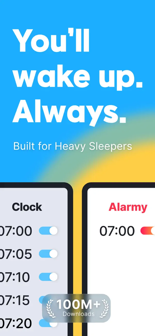
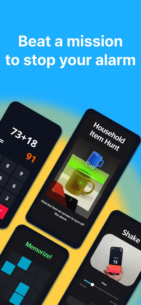
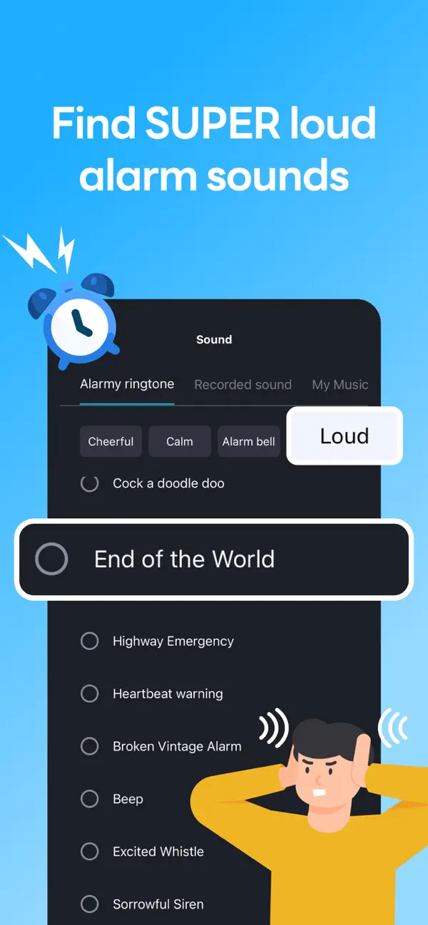
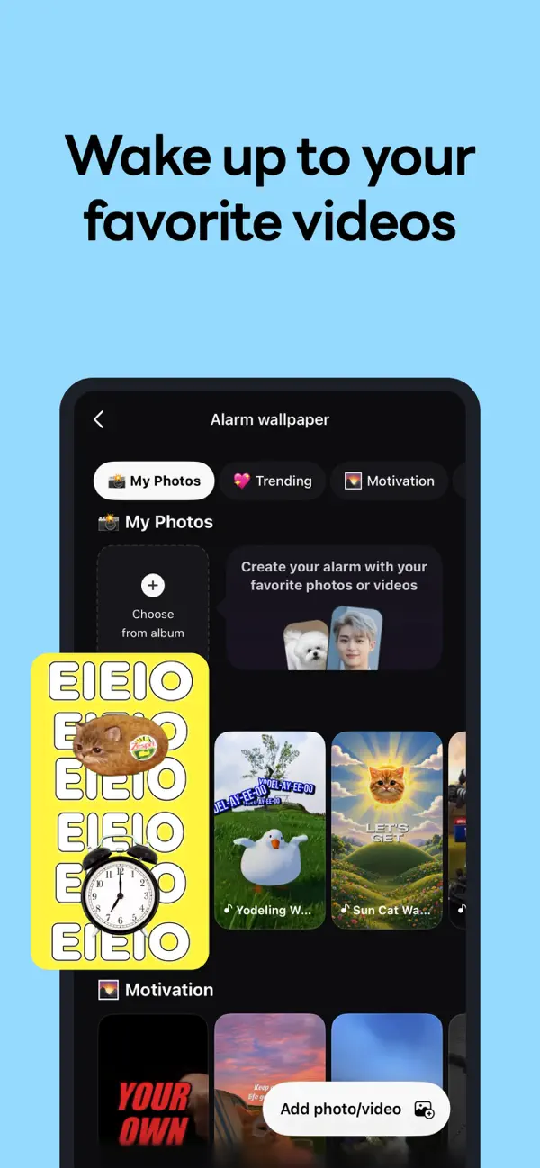
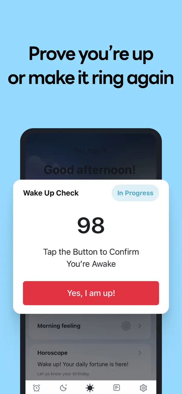
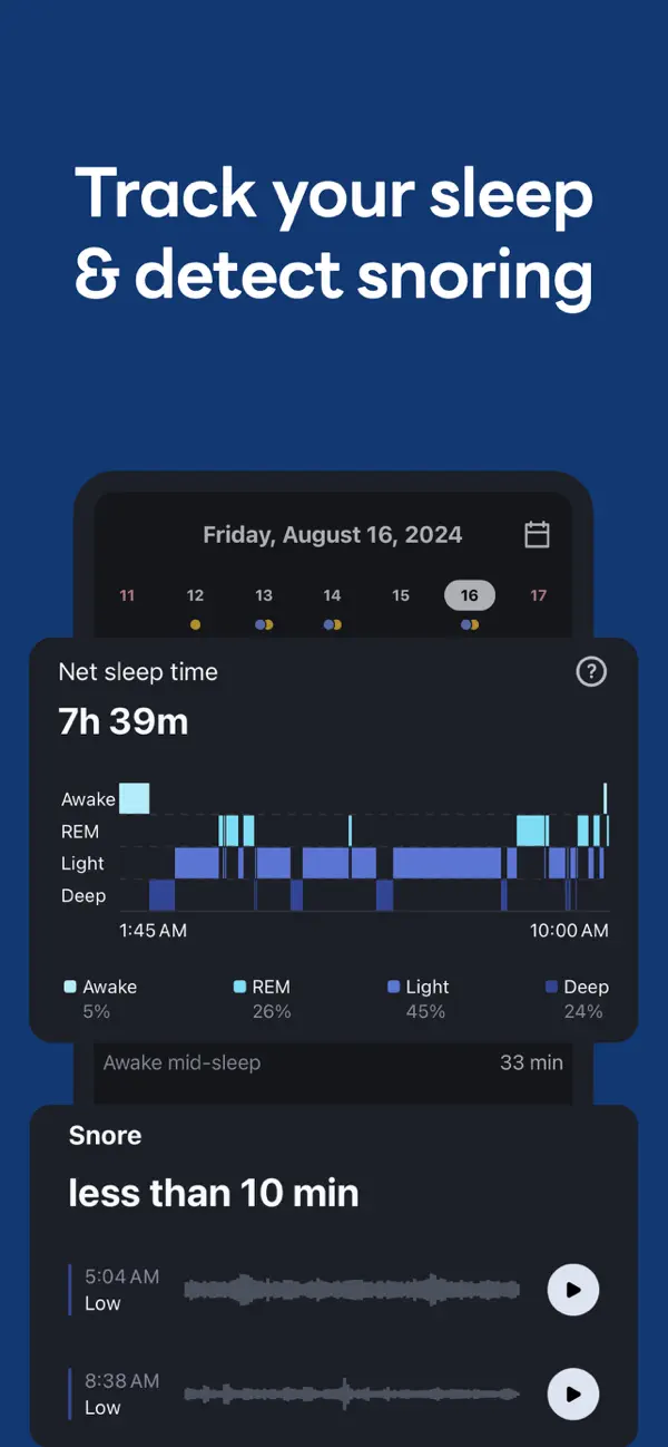
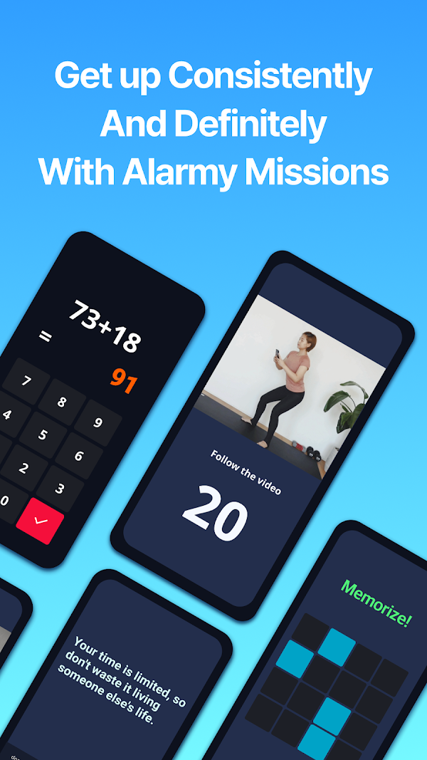
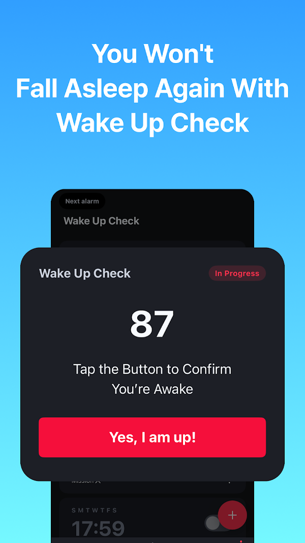
One frame = one idea, six frames = an emotional arc: promise → gate → sound → personal → trust → morning-after. This is, almost beat for beat, the Intention → Confidence → Trust → Gentle Awakening arc Pawan specified after hop 6. The #1 alarm app on earth structures its story the way Pawan structured his wizard.
Sleep Cycle 4.68★ · 26,679 ratings · “Sleep Cycle - Tracker & Sounds”


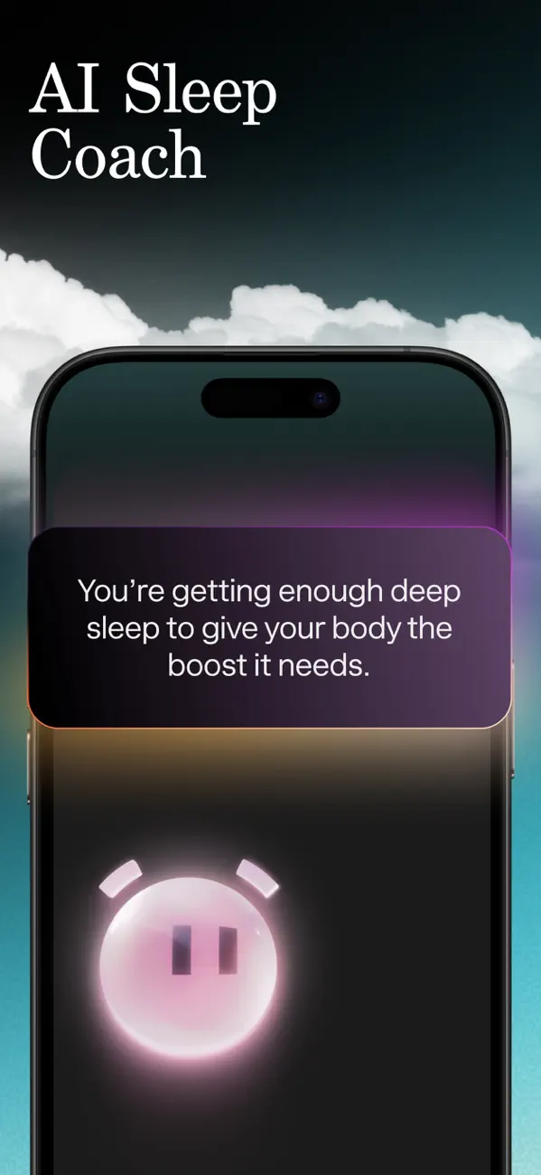


Breathing room is the aesthetic. Every frame is ~40% empty sky. Nothing touches the edges; the phone itself floats at an angle with generous margin — the visual equivalent of the “each screen ≤ 75% of the viewport” constraint the timer build violated by cramming.
Alarm Clock for Me 4.59★ · 123,724 ratings · Apalon
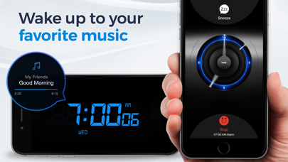
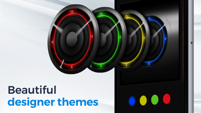
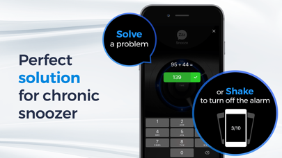
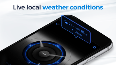
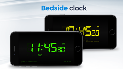
The product is a stage, not a form. Its hero surface is a full-screen nightstand clock — an app that fills one viewport and never scrolls. The oldest app of the six understood “it’s an app, not an article” a decade ago.
Alarmy (Android) droom.sleepIfUCan · 8 carousel frames
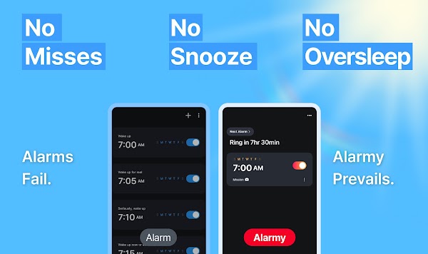
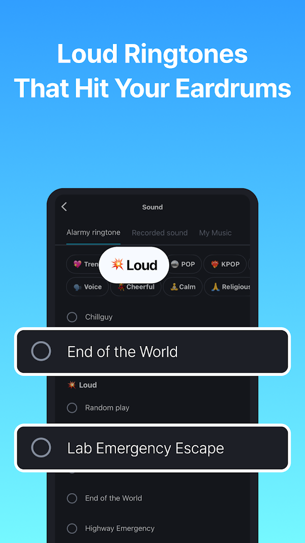
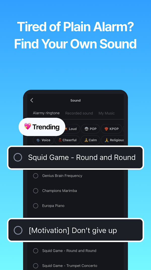
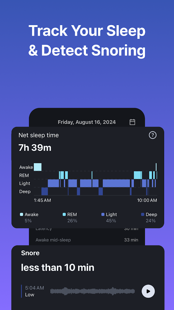
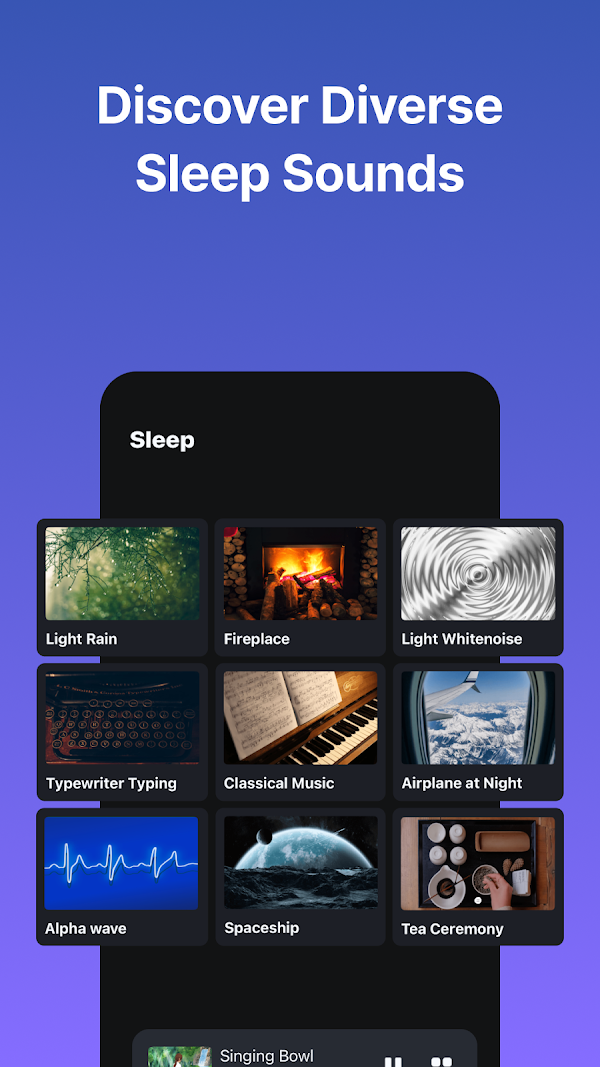
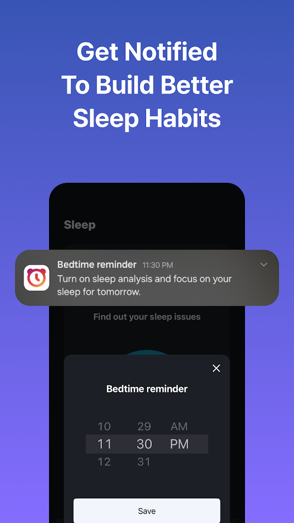
The sound picker gets two whole frames. Choosing and previewing your alarm sound is treated as a headline feature — the same feature Pawan had to demand (“let the user PICK the sound”) before the timer build included it.
Sleep as Android com.urbandroid.sleep · Editor’s Choice · 32M sleepers · 14 frames
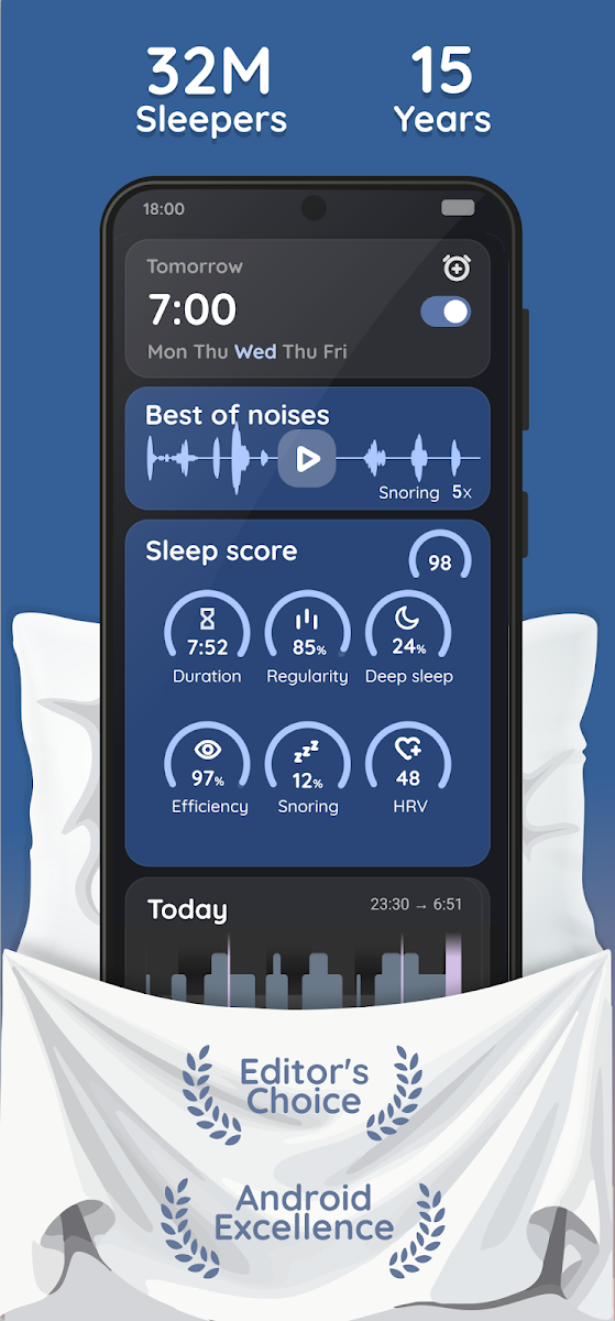
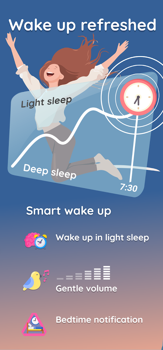
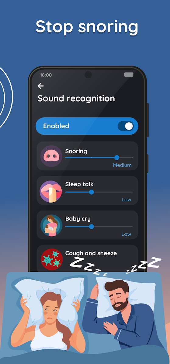
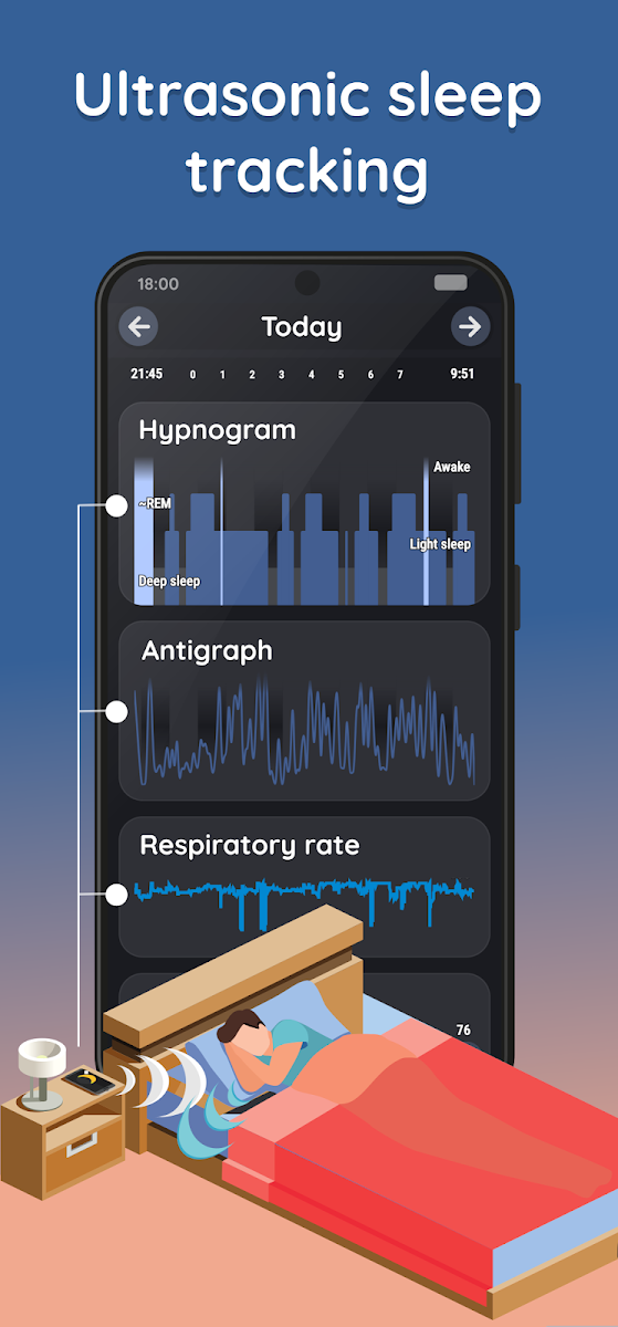
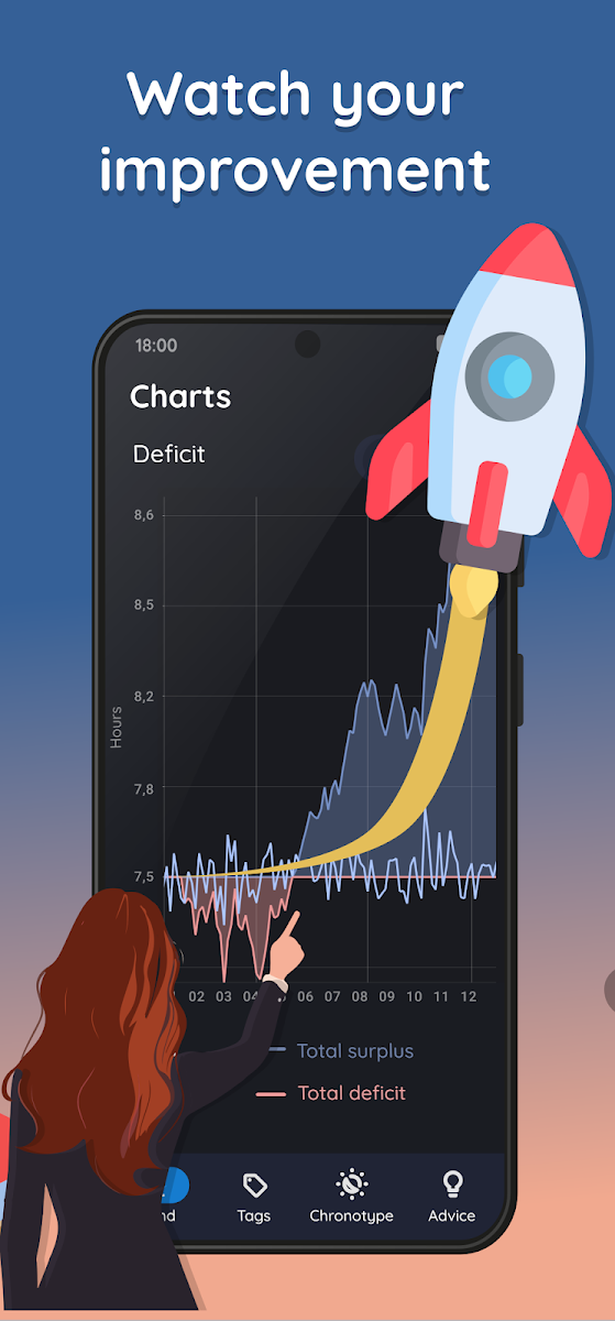
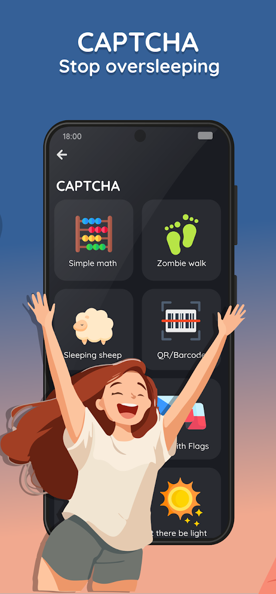
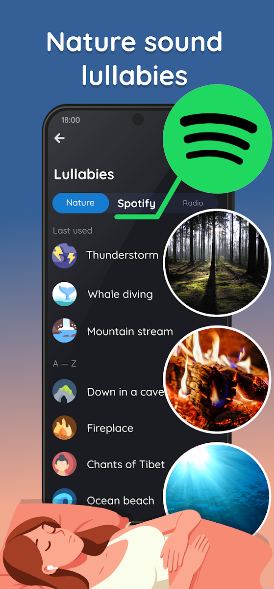
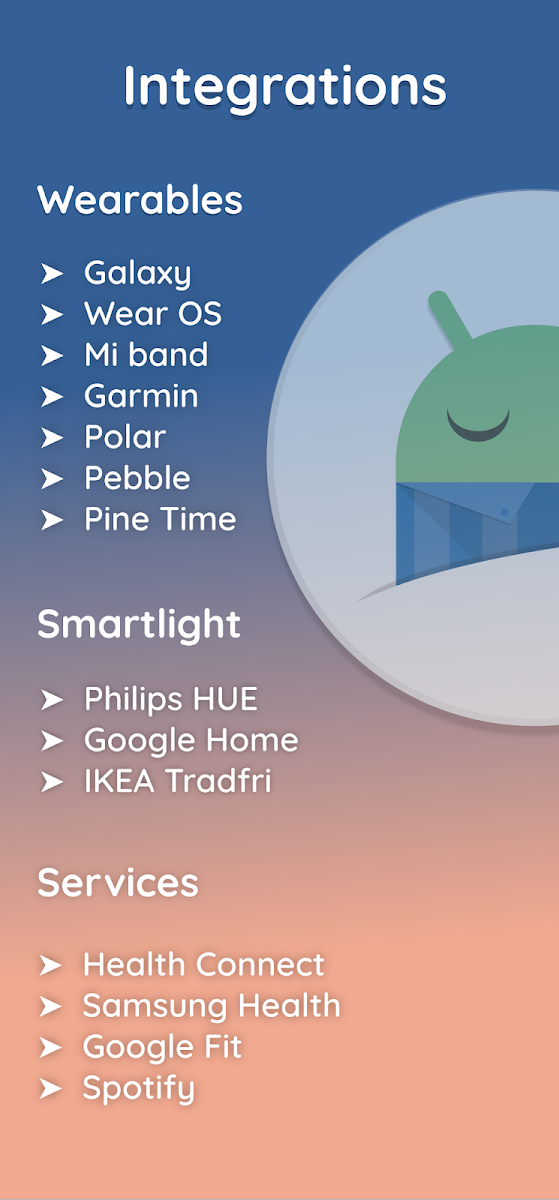
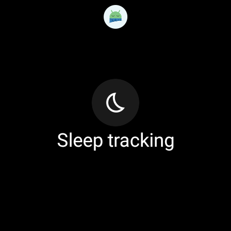
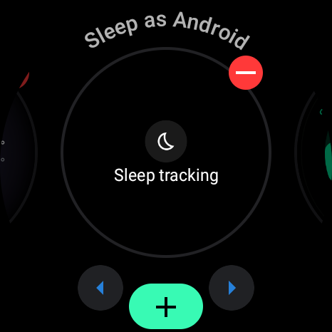
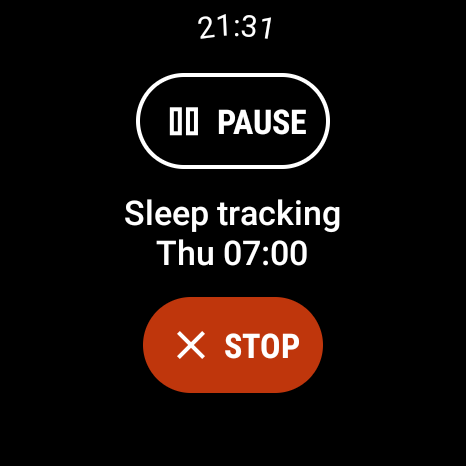
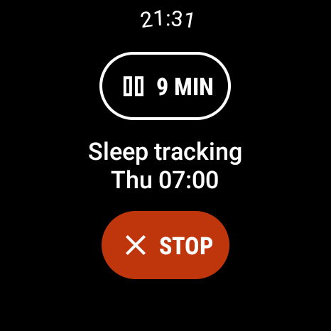
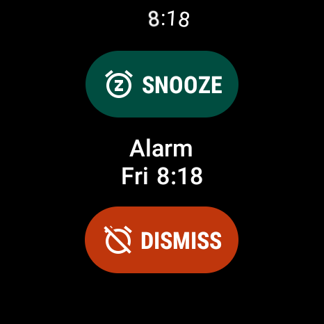
Even 100s of features are sold one per frame. The most feature-dense alarm app in existence still never shows two ideas in one frame — 14 frames instead of one crowded frame. Feature density is expressed as MORE SCREENS, never as cramming.
AMdroid com.amdroidalarmclock.amdroid · 14 frames
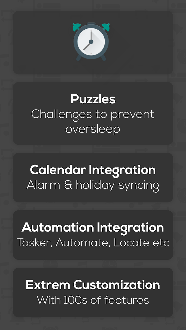
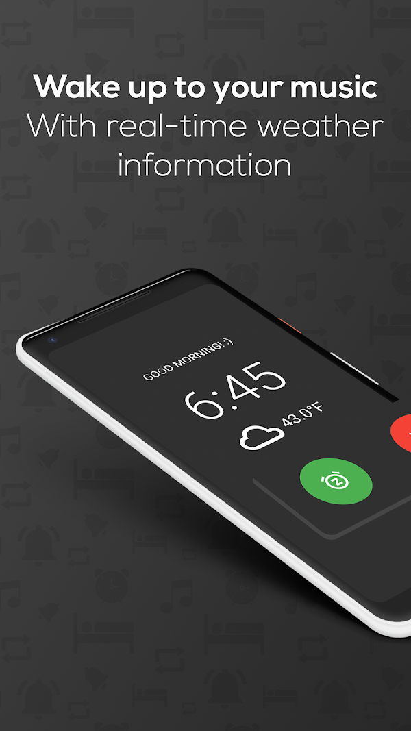
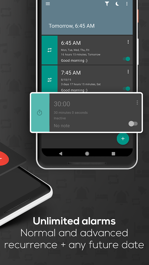
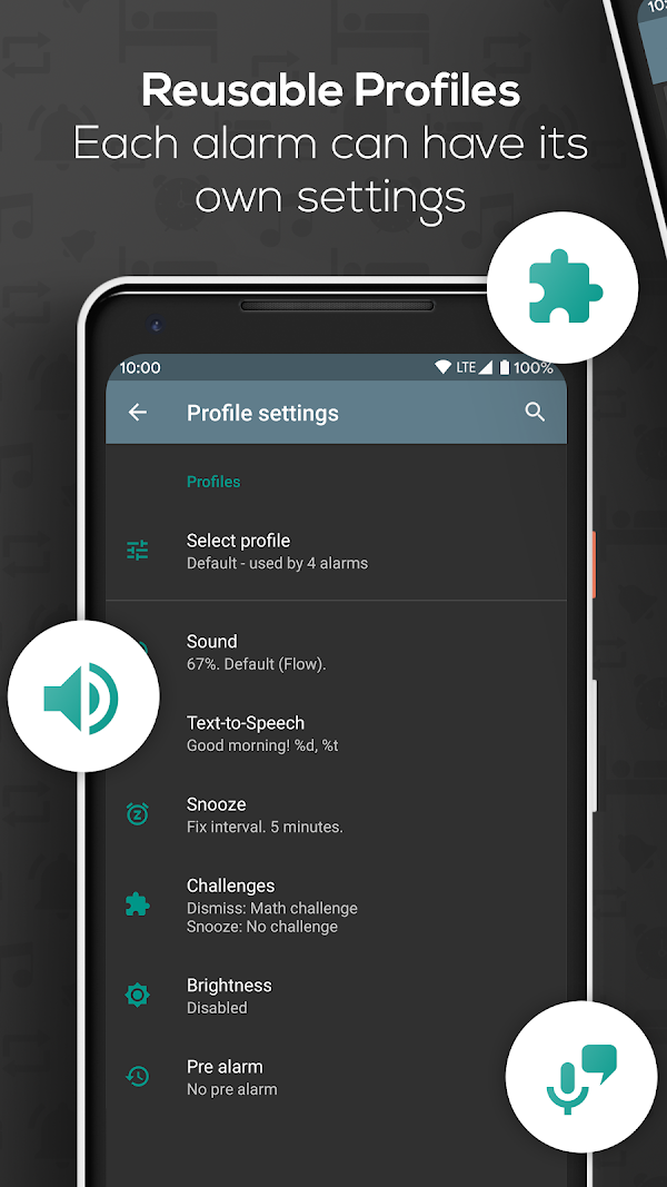
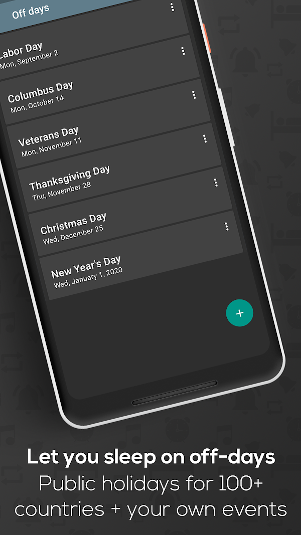
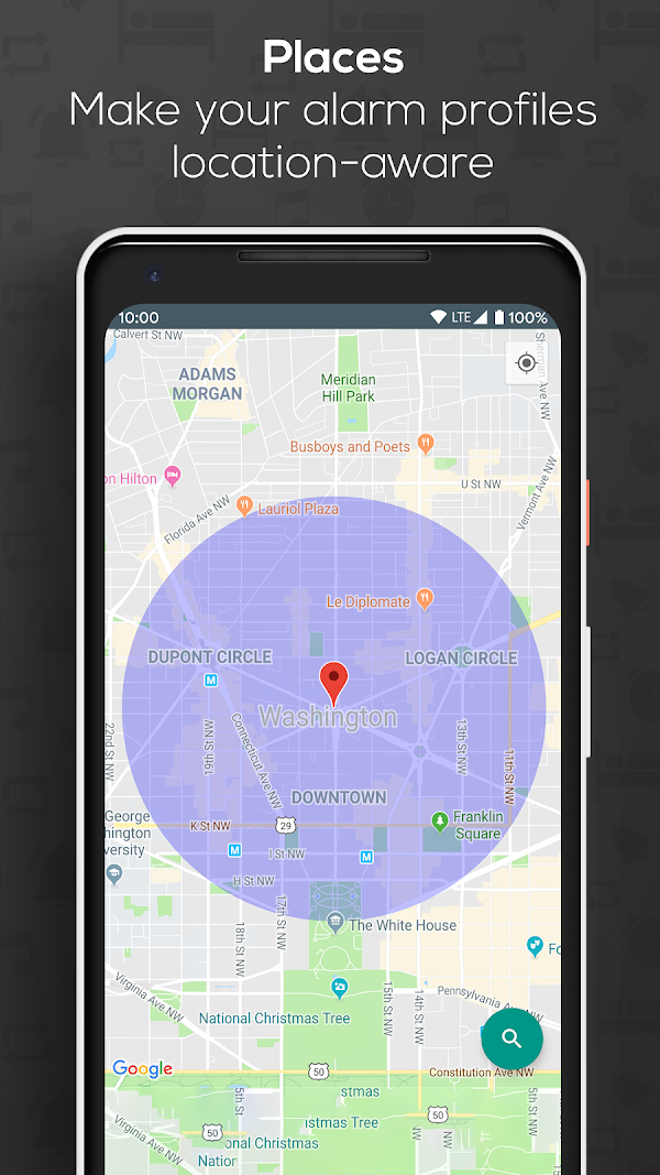
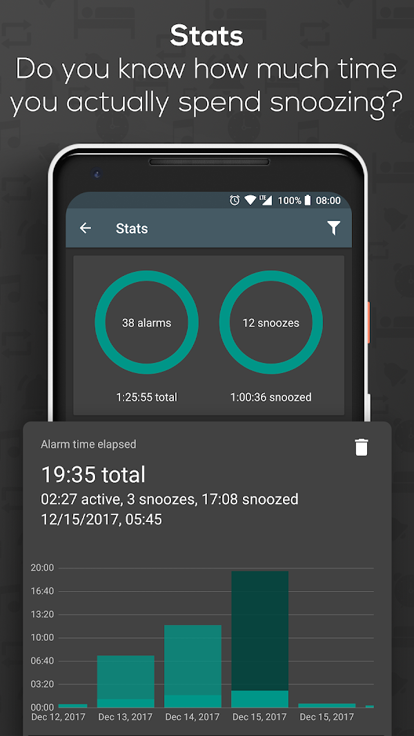
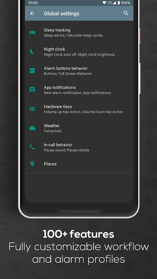
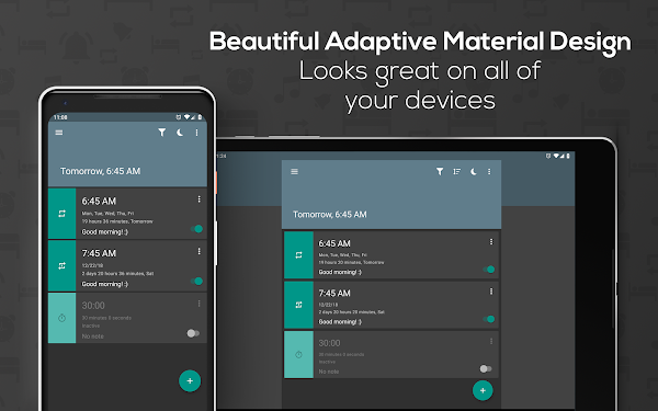

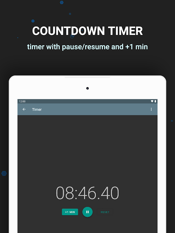
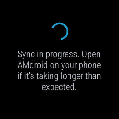
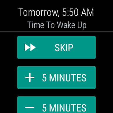
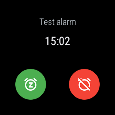
The cautionary tale of the six. Its first frame is a stacked text-card feature list — the closest thing in this study to the timer session’s “one giant crammed card”. It is also the least-loved app of the six. Cramming correlates with losing.
The carousel playbook what all six agree on
- One frame, one idea. Not one app in the top six ever puts two decisions in one frame. The market-wide grammar of alarm-app presentation IS the multi-screen wizard.
- Headline speaks outcome, ≤ 7 words. “You’ll wake up. Always.” · “Wake up refreshed” · “Sleep Better Tonight” — felt, human, never “Set timer”.
- The UI shown is compact. Real screens have small refined controls; the drama comes from the big headline and empty backdrop, never from train-size buttons.
- Accent discipline. Sleep Cycle’s orange lives only in a thin ring; Alarmy’s red only on the single action button. One accent, used at < 5% of pixels, on the one thing you should touch.
- Whitespace ≈ 40% of every frame. The subject floats; nothing touches edges (the ≤ 75% rule, practiced).
- Sound choice is a hero feature. Frames dedicated to browsing/previewing tones in 3 of 6 apps.
- The gate and the wake-check are the differentiators — missions, CAPTCHA, Wake Up Check. Our R1/R2/R3 ladder + 3 gates + anti-relapse guard are exactly this class of feature; the ENGINE we built is market-right.
- Proof, not adjectives. 100M+ downloads, 32M sleepers, Editor’s Choice, award names — numbers and named awards, never “beautiful and powerful”.
The honest comparison post-mortem failure × what the pros do
| What the session did (POST_MORTEM.md) | What every top store carousel does | Verdict |
|---|---|---|
| Crammed the whole wizard on ONE page, Set button pushed off-screen; ignored “multiple screens” twice. | One idea per frame, always — even 100-feature Sleep as Android uses 14 frames rather than one dense one. Only weak AMdroid stacks a text list, and it trails the pack. | Pawan’s spec = the industry grammar. The session fought the market standard, not just the client. |
| Train-size buttons and an orange slab CTA. | Compact pills and small toggles inside the phone; Sleep Cycle keeps orange to a hairline ring; Alarmy’s red exists on exactly one button. | “Orange is an accent” isn’t taste — it’s how the category leaders paint. |
| Invented a palette (--paper/--amber/--hair) → invisible borders, strange text. | Each app has ONE locked brand system used with total consistency across every frame (Alarmy blue, Sleep Cycle sky+dark, SaA indigo). | Brand systems are frozen assets — same as “gold means gold”. |
| App scrolled like an article; full mega-nav header left on. | Every screen shown is a single-viewport stage — bedside clocks, mission screens, score rings. No alarm app screen scrolls; no chrome beyond a slim bar. | “Apps never scroll” is visible in all 53 frames. |
| Sound choice arrived only after Pawan demanded it. | Alarmy devotes 2 of 8 Android frames to sound browsing; ACFM leads with “Wake up to your favorite music”. | The user’s first request was the market’s headline feature. |
| Machine copy: “Set timer / New timer”. | “You’ll wake up. Always.” · “Prove you’re up or make it ring again” · “Wake up refreshed”. | Felt copy is not a nicety; it is the category’s selling voice. |
| 2-minute timer jumped to tomorrow (time-model bug). | Alarmy’s home shows “Ring in 7hr 30min” — countdown-to-ring is the primary reassurance line of the whole category. | Duration-first thinking is the standard mental model; the fix was the right call. |
| Engine: 3 gates, R1→R2→R3 ladder, anti-relapse Wake-Up guard, SSE sync, offline firing — verified. | Missions, snooze-limits and Wake Up Check are precisely the features the leaders lead with. | The one part built without ego is the one part that is genuinely competitive. |
Verdict
The 7/200 session didn’t fail because the product idea was hard. It failed because the build ignored a presentation grammar so universal that every single one of the six market leaders follows it: one idea per screen, felt headline, compact controls, one disciplined accent, 40% air, sound as a hero, proof over adjectives.
Pawan’s wizard spec — multiple screens on an emotional arc, ≤ 75% viewport, no train buttons, pick-your-sound, amber as accent — wasn’t a personal quirk to be second-guessed. It was a market-accurate description of how winning alarm experiences are actually composed. The instinct that overrode it was wrong twice: wrong against the client, and wrong against the category.
What survives with pride: the engine. Gates, ladder, anti-relapse, SSE, offline firing map one-to-one onto the differentiators Alarmy and Sleep as Android lead their carousels with. Fix the P0 stylesheet, then rebuild the wizard to the grammar above — which is simply Pawan’s spec, executed literally.