The Invisible Hand
Watch how the eye is pulled across a canvas without a single arrow. Visual Hierarchy is the art of giving importance to elements. We explore how size, weight, and contrast dictate exactly what your users see first, second, and last.
What's going on
Visual Hierarchy is the arrangement of elements in a way that implies importance. It is the invisible scaffolding of design. By manipulating size, color, contrast, and alignment, a designer acts like a conductor, telling the viewer's eye exactly where to look first, what to read next, and when to take action. Without it, the brain suffers cognitive overload trying to process everything at once.
The human brain is wired to process visual anomalies to survive. A massive shape, a sudden burst of high contrast, or an element sitting alone in a sea of white space triggers immediate attention. By stacking these variables, you assign a "Visual Weight" to every object. The heavier the object, the higher it sits in the hierarchy. The eye naturally jumps (saccades) from the heaviest element to the next heaviest.
- Everything is bold → When everything screams, nothing is heard. Flat hierarchy causes analysis paralysis.
- Contradictory signals → A giant, faint grey text vs a tiny, neon red button. Contrast often overpowers scale in peripheral vision.
- Cultural reading patterns → Western audiences read Z-pattern (left-to-right). Placing a small element in the top-left gives it artificial weight before styling is even applied.
See it live
The dashed line represents the saccades — the rapid jumps your eye makes. A strong hierarchy creates a predictable, effortless path. Notice how the shape of the button and the high contrast orange override the reading flow.
Cultural Reading Patterns
Before you apply weight, you must understand gravity. In the Western world, gravity pulls the eye Top-Left to Bottom-Right. These are the default paths the eye will take if you do not intervene with strong hierarchy.
For sparse, landing-page layouts. The eye sweeps left-to-right, cuts diagonally, and sweeps again. Place your primary CTA at the end of the Z.
For text-heavy layouts. The eye reads the top, then scans straight down the left edge searching for bold keywords.
You are the eye
👁️ Interactive Scan-Path Demo
See the logic
Design isn't just feelings; it's a measurable system of weights. This lab lets you adjust the visual weight of an element and see how it dominates the grid.
⚖️ The Visual Weight Lab 2.0
In the real world
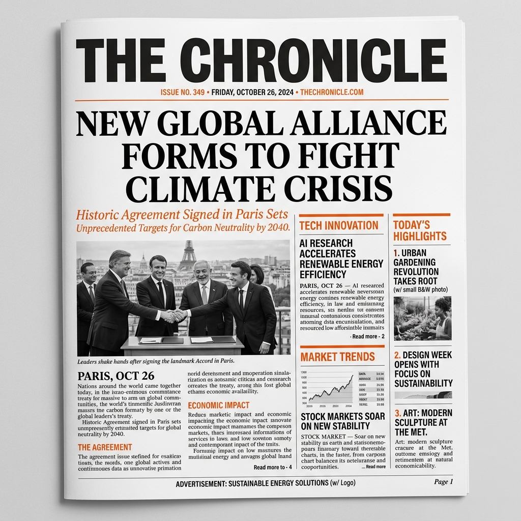
The Front Page
Newspapers perfected hierarchy centuries ago. The massive bold headline is read first, the subheading gives context, and the dense, small body text is read last. It tells you what matters before you read a single word.
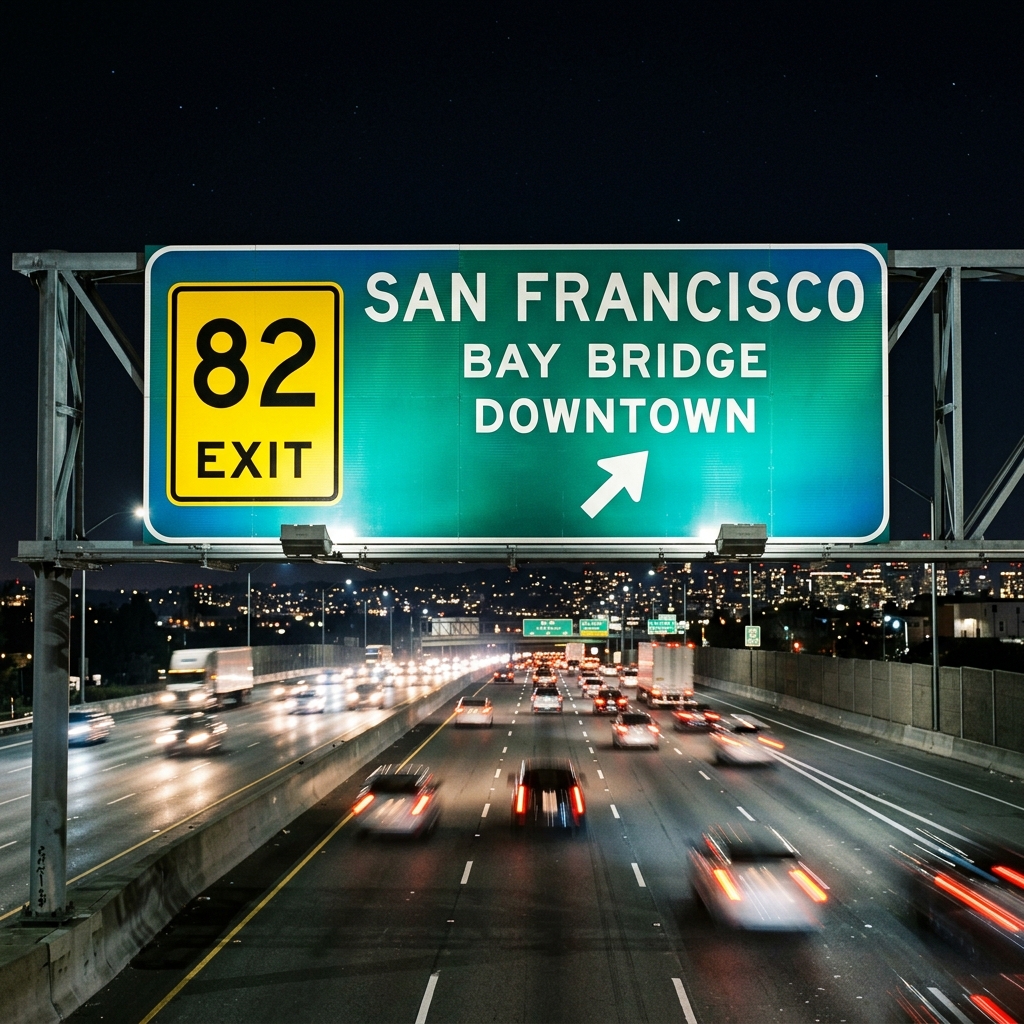
Highway Signage
At 70mph, you only have milliseconds. The city name is huge (Size), the exit number is inside a bright yellow box (Contrast), and the distance is smaller. Perfect hierarchy saves lives.
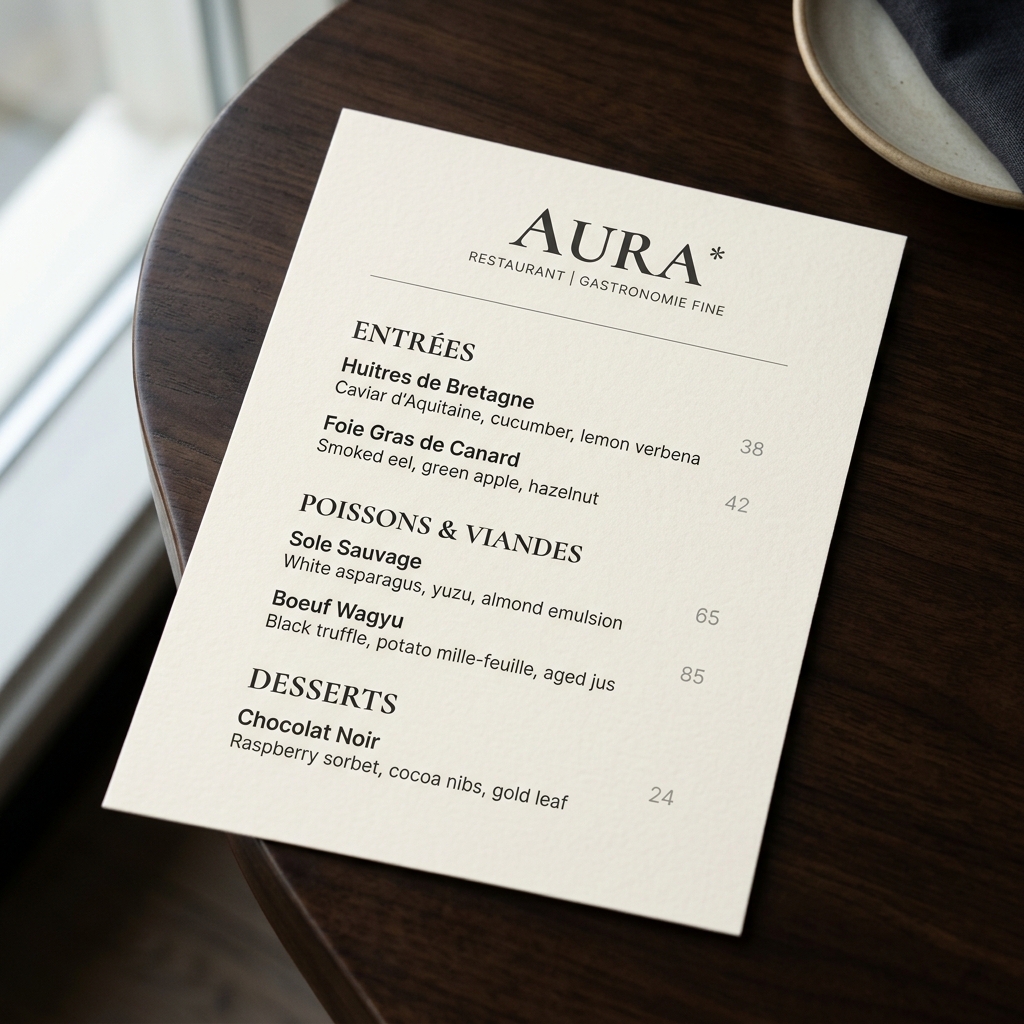
The Restaurant Menu
Look at a menu. The prices are often visually suppressed (smaller, lighter color) while the dish names are bolded. The restaurant's hierarchy wants you to focus on the food, not the cost.
Hierarchy Repair Workshop
🔧 Fix the broken UI
The design, beyond the basics
Visual Hierarchy is the foundation of all effective design. Here we explore the deep psychological reasons behind why our eyes follow specific paths, and how cognitive load is managed across interfaces.
What is the exact difference between Visual Weight and Visual Direction?
Visual weight is the perceived "heaviness" or commanding presence of an element, determined by size, contrast, or color density. It dictates where the eye lands first. Visual direction, however, is the implied path the eye is guided to take after landing, created through leading lines, pointing shapes, or the alignment of a grid. While weight acts as an anchor, direction acts as a roadmap.
Can Visual Hierarchy ever be perfectly flat?
No, a perfectly flat hierarchy is practically impossible in human perception. Even if a designer makes every element identical in size, color, and spacing, the human brain will inherently assign importance based on cultural reading patterns (like the Z-pattern in Western cultures, meaning the top-left will naturally hold more weight). True flatness results in chaos, not equality.
How does the Gestalt Principle of Proximity influence hierarchy?
Proximity is one of the most powerful tools in hierarchy. When elements are placed close together, the brain groups them into a single visual unit, reducing cognitive load. If you have 10 separate links, they look like clutter. If you group them tightly under a single bold heading, the brain processes them as "one menu list." Space is an active tool used to isolate important elements (giving them high weight) or cluster related ones.
What happens when size and contrast give contradictory signals?
When a massive, low-contrast element (like a giant light-grey watermark) competes with a tiny, high-contrast element (like a small neon-red button), contrast usually wins the initial saccade jump. The brain is evolutionarily wired to spot anomalies and bright "danger" signals before evaluating overall mass. Designers use this to make primary CTA buttons highly visible without needing them to dominate the physical space of the layout.
How do eye-tracking studies validate visual hierarchy?
Eye-tracking studies, such as the famous Nielsen Norman Group research, reveal empirical patterns like the F-pattern for text-heavy pages and the Z-pattern for landing pages. Heatmaps show that users do not read linearly; they scan for large headers (weight) and bullet points (proximity/repetition). These studies prove that hierarchy is not subjective art, but a measurable manipulation of human saccadic eye movements.
How is Visual Hierarchy used to deliberately obscure information (Dark Patterns)?
Hierarchy can be weaponized. In "Dark Patterns," designers invert standard hierarchy rules. For example, a subscription cancellation page might make the "Keep Subscription" button massive, green, and highly contrasted, while the "Cancel" option is tiny, low-contrast, and placed far from the natural reading path. By manipulating weight and proximity against the user's intent, the interface intentionally causes confusion and misdirection.
What are the key differences between Typographic and Spatial Hierarchy?
| Feature | Typographic Hierarchy | Spatial Hierarchy |
|---|---|---|
| Primary Tools | Font size, weight, case, spacing | Grid placement, proximity, white space |
| Goal | Guide reading order and text comprehension | Structure layout and content grouping |
| Example | H1 Header > H2 Subhead > Paragraph | Hero section > 3-column feature grid > Footer |
| Failure Result | User cannot distinguish headings from body text | User cannot find the navigation or CTA button |
Glossary — the 12 words that unlock it
Scale
- What it means
- The relative size of elements to each other.
- Why it matters
- It instantly tells the eye what is most important.
- Key question
- If everything is large, is anything large?
Contrast
- What it means
- The difference in color, brightness, or texture.
- Why it matters
- It acts as a spotlight, pulling attention regardless of size.
- Key question
- Does this element stand out when you squint?
Weight
- What it means
- The perceived physical heaviness of an element.
- Why it matters
- Heavy elements anchor a design; light elements float.
- Key question
- Does the layout feel lopsided?
Alignment
- What it means
- The invisible grid lines elements snap to.
- Why it matters
- It reduces cognitive load by organizing chaos.
- Key question
- Can you draw a straight line through the edges?
Proximity
- What it means
- Grouping related items closely together.
- Why it matters
- The brain naturally assumes close things belong together.
- Key question
- Are the gaps between groups larger than gaps inside groups?
Whitespace
- What it means
- The empty "negative" space around elements.
- Why it matters
- It gives the eye room to rest and isolates importance.
- Key question
- Is the design breathing?
Z-Pattern
- What it means
- The natural eye sweep for sparse, landing-page layouts.
- Why it matters
- Matches Western reading (left-right, diagonal down, left-right).
- Key question
- Is your CTA at the end of the Z?
F-Pattern
- What it means
- The natural eye sweep for text-heavy pages.
- Why it matters
- Users read the top, then scan down the left edge.
- Key question
- Are key words front-loaded on the left?
Focal Point
- What it means
- The single element that demands attention first.
- Why it matters
- Without a focal point, the user doesn't know where to start.
- Key question
- Where did your eye land in the first 50 milliseconds?
Saccade
- What it means
- The rapid, involuntary jump the eye makes from one fixation point to the next.
- Why it matters
- Hierarchy is really a map of saccades — you choreograph where the eye leaps, and in what order.
- In practice
- Strong focal points create long, confident jumps; weak hierarchy makes the eye stutter and backtrack.
- Key question
- Trace the jumps — is the path smooth, or does the eye wander?
Value vs Hue
- What it means
- Value is how light or dark a colour is; hue is the colour itself (red, blue, green).
- Why it matters
- The eye reads value contrast far faster than hue — which is exactly why the squint test works.
- In practice
- A dark button on a light card out-ranks a bright-but-similar-value button every time.
- Key question
- In greyscale, does your focal point still win?
Dark Pattern
- What it means
- Hierarchy weaponised against the user — steering them toward choices they did not intend.
- Why it matters
- The same levers that help users can manipulate them; ethics is part of the craft.
- In practice
- A giant "Accept All" beside a tiny grey "Decline" is hierarchy used to mislead.
- Key question
- Does the loudest element serve the user, or the business?
The 5-Second Memory Test
🧠 Memory Simulation
Test yourself — a mixed set
Seven question formats, the way Beyond Dictionary serves them. Every question has layered hints — a quick nudge, the reasoning, then a deeper connection — so a wrong answer opens a door, never a dead end.
↑ Back to top