Overview
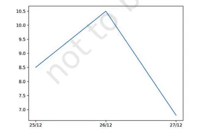
This chapter introduces Plotting with Pyplot (matplotlib.pyplot) for visualizing and interpreting data in Class 12 Informatics Practices. It explains the pyplot interface and shows how to create common chart types (line, scatter, bar, histogram, pie, etc.), customize appearance (labels, titles, legends, colors, markers, styles), arrange multiple plots (subplots), and save figures. Importance: graphical representation helps in exploratory data analysis, pattern recognition, comparison, and communication of results—an essential skill for data literacy and further studies in data science. Key themes include pyplot basics (import, plot/display), plot types and when to use them, reading data with NumPy/Pandas and plotting DataFrame columns, customizing axes and annotations, combining multiple plots, and exporting figures. By the end of the chapter students will be able to: import and use matplotlib.pyplot, choose appropriate plot types for different data, produce clear and properly labeled visualizations, create subplots, read data from files and plot it, and save publication-quality images—enabling them to analyze and present data effectively.
Learning Objectives
- Define the purpose and components of matplotlib.pyplot (Pyplot) for data visualization
- Explain the difference between figure and axes objects and their roles in plotting
- Describe how to create basic plots such as line, scatter, bar, histogram and pie using Pyplot
- Apply parameters like color, linestyle, linewidth, marker and alpha to customize plot appearance
- Use axis labels, titles, legends and grid to enhance plot readability
- Set axis limits, ticks and scales (linear/log) to control plot scaling and presentation
- Create multiple subplots in a single figure and adjust layout using figsize and tight_layout
- Plot data from Python lists, NumPy arrays and pandas DataFrame/Series
Topics in this chapter
22 topics · tap a topic title to jump straight to it.
Introduction to Plotting with Pyplot
What is Pyplot?
Pyplot is a module in the matplotlib library that provides a MATLAB-like interface to create 2D plots easily in Python. It converts arrays or lists of data points into visual graphs (line plots, bar charts, scatter plots, histograms, etc.) and provides functions to label axes, add titles, legends, grids and save figures.
Why use Pyplot?
Visualisation helps to understand trends, patterns, distributions and relationships in data quickly — essential for data analysis in Informatics Practices.
Basic workflow
1. Import pyplot: import matplotlib.pyplot as plt.
2. Prepare data (lists, tuples or NumPy arrays).
3. Call a plotting function (e.g., plt.plot, plt.bar, plt.scatter, plt.hist, plt.pie).
4. Add labels/title/legend: plt.xlabel, plt.ylabel, plt.title, plt.legend.
5. Display figure: plt.show(). Optionally save: plt.savefig('file.png').
Key functions (examples)
import matplotlib.pyplot as plt
x = [1,2,3,4]
y = [10,20,25,30]
plt.plot(x, y, marker='o', color='b', linestyle='-')
plt.xlabel('X axis')
plt.ylabel('Y axis')
plt.title('Simple Line Plot')
plt.grid(True)
plt.show()
Customization options
You can change color, marker, line style, linewidth, axis limits (plt.xlim, plt.ylim), tick labels, font sizes and figure size (plt.figure(figsize=(w,h))). Use plt.subplot or plt.subplots to draw multiple plots in one figure.
Common plot types and when to use
- Line plot: time series or continuous change.
- Bar chart: comparisons between categories (sales per month).
- Scatter plot: relationship/correlation between two numeric variables.
- Histogram: distribution of a numeric variable (frequency of score ranges).
- Pie chart: parts of a whole (percentage share).
- Box plot: spread, median and outliers.
Good practice
Always label axes, add a title and legend for multiple series, use grid lines for readability and choose appropriate plot type for the data. Keep plots simple and informative.
- Temperature over a week (line plot): x = ['Mon','Tue','Wed','Thu','Fri','Sat','Sun']; y = [30, 32, 31, 29, 28, 27, 29]; use plt.plot(x,y, marker='o') to show trend.
- Monthly sales (bar chart): months = ['Jan','Feb',...]; sales = [1200,1500,...]; plt.bar(months, sales, color='green'); add labels and title to compare months.
- Exam scores distribution (histogram): scores = [45,67,78,89,56,...]; plt.hist(scores, bins=5, edgecolor='black') to see how many students fall in each range.
- Relationship between study hours and marks (scatter): hours = [1,2,3,4,5]; marks = [20,40,50,65,80]; plt.scatter(hours, marks); optionally fit a regression line y = mx + c to indicate trend.
- Market share of products (pie chart): shares = [40,25,20,15]; labels = ['A','B','C','D']; plt.pie(shares, labels=labels, autopct='%1.1f%%') to show percentage shares.
- Linear relation (used to plot straight-line fits): y = m*x + c, where m is slope and c is intercept.
- Arithmetic mean (useful for plotting average lines): mean = (Σx_i) / n
- \[Moving average (smooths time series): MA_k = (x_{t} + x_{t-1} + ... + x_{t-k+1}) / k\]
- Percentage (for pie charts): percent = (part / total) * 100
- Frequency density (for histograms with unequal bin widths): density = frequency / bin_width
Getting Started with matplotlib.pyplot
Overview
matplotlib.pyplot (commonly imported as plt) is the state-machine interface of Matplotlib. It provides functions to create, customize and display 2D plots (line, bar, scatter, histogram, pie, etc.). Typical workflow: prepare data, call plotting functions, customize (labels, title, legend), then display with plt.show() or save with plt.savefig().
Basic steps
- Import libraries:
import matplotlib.pyplot as pltand oftenimport numpy as npfor numeric arrays. - Prepare x and y data (lists or NumPy arrays). Length of x and y must match for most plots.
- Call a plotting function, e.g.
plt.plot(x, y, fmt, label='...'). - Add labels and title:
plt.xlabel(),plt.ylabel(),plt.title(). - Add legend and grid:
plt.legend(),plt.grid(True). - Show or save:
plt.show()orplt.savefig('plot.png').
Common pyplot functions
plt.plot()— line plot; accepts format string (color/marker/linestyle) andlabel.plt.scatter()— scatter plot (x vs y points).plt.bar(),plt.barh()— vertical/horizontal bar charts.plt.hist()— histogram for distribution of values.plt.pie()— pie chart for proportional data.plt.figure(),plt.subplots(),plt.subplot()— create figures and subplots.plt.xlim(),plt.ylim()— set axis limits.plt.savefig()— save the current figure to a file.
Simple code example
import matplotlib.pyplot as plt
x = [1, 2, 3, 4, 5]
y = [10, 15, 13, 17, 20]
plt.plot(x, y, 'o-', color='blue', label='Sales')
plt.xlabel('Month')
plt.ylabel('Sales (units)')
plt.title('Monthly Sales')
plt.grid(True)
plt.legend()
plt.show()
Tips for good plots
- Always label axes and add a meaningful title.
- Use a legend if multiple series are plotted.
- Choose appropriate plot type for the data (time series → line, categories → bar, distribution → histogram, proportions → pie, relationships → scatter).
- Use
plt.subplots()to compare multiple plots side-by-side. - Keep visuals simple and readable: avoid too many colors or markers.
- Monthly sales (line plot): Show sales for 6 months using plt.plot(x, y, 's--', color='green') with xlabel, ylabel, title and grid.
- Student marks distribution (histogram): Use plt.hist(marks, bins=5, color='skyblue', edgecolor='black') to see how marks are spread across ranges.
- Market share (pie chart): categories = ['A','B','C']; values = [40, 30, 30]; plt.pie(values, labels=categories, autopct='%1.1f%%', startangle=90) to display percent shares.
- Height vs weight (scatter plot): plt.scatter(heights, weights, c='red', marker='x'); optionally add a trendline using NumPy's polyfit.
- Compare two subjects (subplots): fig, axes = plt.subplots(1,2); axes[0].bar(...); axes[1].boxplot(...) to place two charts side-by-side.
- Pie chart percentage: percent_i = (value_i / sum(values)) * 100
- Histogram relative frequency (for a bin): relative_frequency = bin_count / total_count
- Basic line format string for plt.plot: 'fmt' can be '[color][marker][linestyle]' e.g. 'ro--' means red circles with dashed line
- If you compute a linear trendline (optional): slope m and intercept c from NumPy: m, c = np.polyfit(x, y, 1); trend_y = m*x + c
Line Plots
What is a line plot? A line plot is a basic 2-D chart that connects data points with straight line segments. It is used to show how a numeric variable changes continuously or sequentially (e.g., over time, distance, or ordered categories). Line plots emphasize trends, slopes (rates of change), and patterns.
When to use: use line plots for time series, measurements over an ordered index, or to compare trends among multiple series.
Key elements in matplotlib.pyplot: the main call is plt.plot(x, y, ...). Common parameters: x and y (data), label, color, linestyle, marker, linewidth. Other important functions: plt.title(), plt.xlabel(), plt.ylabel(), plt.legend(), plt.grid(), plt.xlim()/plt.ylim().
Multiple series: call plt.plot() more than once (or pass multiple x,y pairs) to draw multiple lines on the same axes; use label and plt.legend() to identify them.
Interpreting a line plot: slope between two points gives rate of change; upward slope = increase, downward slope = decrease. Watch for overplotting, noisy data, and uneven x spacing (use proper x values or interpolation).
Best practices: label axes and units, give a descriptive title, choose distinguishable colors/markers for multiple lines, add gridlines or ticks for readability, and avoid connecting points when data are categorical or non-continuous (use markers or step plots instead).
- Daily temperature over a week: x = [Mon, Tue, ...], y = [23, 25, 22, 21, 24, 26, 27] — shows the trend and daily fluctuations.
- Stock closing prices over time: x = dates, y = closing prices — used to identify upward/downward trends and volatility.
- Distance vs time in a motion experiment: x = time (s), y = distance (m) — slope gives instantaneous average speed between measurements.
- Student marks across semesters: x = semester numbers, y = marks — compares performance trend across years.
- Heart rate monitor: x = timestamps, y = bpm — real-time line plot highlights spikes and resting periods.
- Equation of a straight line: y = m x + c, where m is slope and c is intercept.
- Slope (rate of change) between two points (x1,y1) and (x2,y2): m = (y2 - y1) / (x2 - x1).
- \[Simple moving average (window n) at time t: SMA(t) = (1/n) * Σ_{i=0 to n-1} y_{t-i} — smooths noisy line plots.\]
- Percentage change between old and new value: % change = ((new - old) / old) × 100.
Scatter Plots
What is a scatter plot?
A scatter plot (or scatter chart) is a type of plot that shows the relationship between two numeric variables by drawing a point for each pair of values (x, y). It is used to observe patterns, trends, correlation, clusters and outliers.
When to use: Use a scatter plot when you want to examine the association between two continuous variables (for example, study hours vs. marks, height vs. weight).
Basic Pyplot syntaxmatplotlib.pyplot.scatter(x, y, s=..., c=..., marker=..., cmap=..., alpha=..., edgecolors=...)
Key parameters:
- x, y: sequences of values for horizontal and vertical coordinates.
- s: size of points (can be a single value or array for bubble charts).
- c: color or sequence of values to map to colors (works with cmap).
- marker: point style (e.g., 'o', 'x', '^').
- cmap: colormap (e.g., 'viridis', 'coolwarm') used when c is numeric.
- alpha: transparency (helps with overplotting).
- edgecolors: color of marker borders.
Interpretation:
- Positive correlation: points slope upward (as x increases, y tends to increase).
- Negative correlation: points slope downward.
- No correlation: points scattered randomly.
- Clusters: groups of points indicate subgroups.
- Outliers: isolated points that deviate from the pattern.
Extensions:
- Bubble chart: scale point sizes (s) to represent a third numeric variable.
- Color mapping: use c + cmap to show a fourth dimension (e.g., temperature).
- Regression line: fit and draw a line to summarize trend (e.g., least squares line).
- Jitter: add tiny random noise to discrete x or y values to reduce overlap.
Small example (Pyplot)
import matplotlib.pyplot as plt
x = [1,2,3,4,5]
y = [2,4,1,3,5]
plt.scatter(x, y, s=50, c='blue', alpha=0.7, edgecolors='k')
plt.xlabel('X')
plt.ylabel('Y')
plt.title('Simple scatter plot')
plt.show()
Tips: use alpha when points overlap; add a colorbar when using numeric color mapping; use descriptive axis labels and legend when representing categories.
- Simple scatter: Plot study_hours (x) vs marks (y) to see if more study leads to higher marks. Code: plt.scatter(hours, marks, s=40, c='green', alpha=0.6).
- Bubble chart: Compare cities by GDP (x), avg income (y) and population (bubble size). Code: plt.scatter(gdp, income, s=population_sizes, c='orange', alpha=0.6).
- Colored scatter (categorical): Plot sepal_length vs sepal_width and color points by species. Use a color map or map species to marker styles and add a legend.
- Scatter with regression line: Fit a least-squares line to height vs weight. Code: m, c = np.polyfit(height, weight, 1); plt.plot(sorted(height), m*np.array(sorted(height))+c, color='red')
- Pearson correlation coefficient r: r = [Σ(xi - x̄)(yi - ȳ)] / sqrt([Σ(xi - x̄)^2] [Σ(yi - ȳ)^2])
- Least-squares regression line: y = m x + c, where m = Cov(x,y) / Var(x) and c = ȳ - m x̄
- Covariance: Cov(x,y) = (1/n) Σ (xi - x̄)(yi - ȳ) (or use 1/(n-1) for sample covariance)
- Variance: Var(x) = (1/n) Σ (xi - x̄)^2 (or 1/(n-1) for sample variance)
- Coefficient of determination: R^2 = r^2 (measures proportion of variance explained by linear model)
Bar Charts
What is a bar chart?
A bar chart is a categorical plot that represents data with rectangular bars whose lengths are proportional to the values they represent. It is used to compare discrete categories or groups. In Matplotlib (Pyplot) the main functions are plt.bar() for vertical bars and plt.barh() for horizontal bars.
When to use: Use bar charts when you have a small-to-moderate number of categories and you want to compare their numeric values (counts, sums, averages, percentages).
Key components:
- Categories (x-axis): names or labels for each bar.
- Values (y-axis): height (or length) of each bar.
- Bar width and position: control spacing and grouping of bars.
- Colors, edge colors, labels, legend and annotations for readability.
How to create a basic bar chart (steps):
- Prepare data:
categories = ['A','B','C'],values = [10, 20, 15]. - Create x positions:
x = np.arange(len(categories)). - Plot bars:
plt.bar(x, values, width=0.6). - Label ticks:
plt.xticks(x, categories). - Add title/labels/legend and show:
plt.title(...); plt.xlabel(...); plt.show().
Special types and techniques:
- Grouped (side-by-side) bars: use offsets for x positions (e.g.
x + i*width) to compare multiple series across the same categories. - Stacked bars: use the
bottomparameter to stack one series on top of another. - Horizontal bars: use
plt.barh()for long category names or better readability. - Error bars: add uncertainty with
yerrparameter. - Annotations: use
plt.text()to show numeric values on bars.
Example code snippets (Pyplot):
Basic vertical bar:
import matplotlib.pyplot as plt
import numpy as np
categories = ['Math', 'Physics', 'Chem']
values = [78, 85, 72]
x = np.arange(len(categories))
plt.bar(x, values, color='teal')
plt.xticks(x, categories)
plt.ylabel('Score')
plt.title('Student Scores')
plt.show()
Grouped bars (two series):
width = 0.35
x = np.arange(len(categories))
plt.bar(x - width/2, male_scores, width, label='Male')
plt.bar(x + width/2, female_scores, width, label='Female')
plt.xticks(x, categories)
plt.legend()
Stacked bars:
plt.bar(x, part1)
plt.bar(x, part2, bottom=part1)
# bottom can be cumulative sums for more than two layers
Good practices:
- Sort bars when order matters (descending/ascending) to emphasize differences.
- Keep category names readable (rotate x-tick labels if needed:
rotation=45). - Use colors consistently and add a legend for multiple series.
- Annotate values if precise numbers matter.
Note for CBSE Class 12: understand how to prepare data arrays, calculate positions, use width and bottom parameters, and interpret grouped and stacked bar charts.
- Comparing average marks of students in different subjects (vertical bar chart).
- Monthly sales revenue for three product categories (grouped bars to compare months across categories).
- Population distribution by age groups (horizontal bar chart for long age-group labels).
- Survey results showing percentage of responses: Agree/Neutral/Disagree (stacked bar to show composition).
- Daily rainfall amounts for a week (bar chart with error bars representing measurement uncertainty).
- x positions: x = np.arange(n) # n = number of categories
- grouped positions: x_i = x + i * width # i = series index, width = bar width
- percentage: percent = (count / total) * 100
- stacked bottom: bottom_k = sum(previous_series_heights) # for stacking k-th series
- bar width constraint: total_group_width = m * width <= 1.0 (recommended) # m = number of series per category
Histograms
What is a histogram?
A histogram is a graphical representation of the distribution of numerical (continuous or discrete) data. Data are grouped into contiguous intervals called bins or classes; the height of each bar shows the frequency (count) or density of observations in that bin. Histograms reveal shape (symmetry, skewness), spread, central tendency, gaps, outliers and modality (unimodal, bimodal).
Histogram vs Bar Chart
Histograms are for continuous numerical data and use adjacent bars (no gaps). Bar charts are for categorical data and have gaps between bars.
Key components
- Bins: contiguous intervals that partition the data range.
- Counts/frequencies: number of observations per bin.
- Bin edges: numeric boundaries for each bin.
- Density/normalization: whether heights show raw counts or probability density (area sums to 1).
Using matplotlib (pyplot)
Typical call: plt.hist(data, bins=..., range=..., density=..., cumulative=..., histtype=..., rwidth=..., color=..., alpha=..., edgecolor=...). The function returns (counts, bin_edges, patches) or you can use np.histogram to get counts and edges without plotting.
Interpreting histograms
- Tall bars indicate intervals with many observations.
- The shape indicates distribution (normal, skewed left/right, uniform, multimodal).
- Changing number/width of bins can reveal or hide features; choose bins carefully.
Choosing number/width of bins
- Sturges' rule: k = 1 + log2(n) (simple, often used for smaller n).
- Square-root rule: k ≈ sqrt(n).
- Freedman–Diaconis rule (robust): bin width h = 2 * IQR / n^(1/3), then k ≈ (max - min) / h. IQR is interquartile range.
Common histogram options
- bins: integer or sequence of edges.
- range: (min, max) to limit the plotted range.
- density=True: plot probability density (area=1).
- cumulative=True: cumulative histogram.
- histtype: 'bar', 'barstacked', 'step', 'stepfilled'.
- rwidth: bar width relative to bin width.
- alpha, color, edgecolor: styling.
Returned arrays
From counts, bin_edges = np.histogram(data, bins=...): counts[i] is count in interval [bin_edges[i], bin_edges[i+1]). For plotting, use edges to position bars.
Applications / why it matters
Histograms are widely used in statistics, data analysis, quality control, and machine learning for exploratory data analysis, feature understanding, detecting skewness, and selecting transformations (e.g., log) or binning schemes.
- Exam score distribution: Given scores array, use plt.hist(scores, bins=10, edgecolor='black') to visualize how many students fall into each score range. This helps identify class performance and find common score ranges.
- Heights of students: plt.hist(heights, bins=15, density=True) and overlay a normal curve to check approximate normality of heights.
- Daily rainfall amounts: Use plt.hist(rainfall, bins='fd') where 'fd' applies Freedman–Diaconis rule (many libraries accept it) or compute bin width with h = 2*IQR/n^(1/3). This shows frequency of light vs heavy rain days.
- Website response time: Plot plt.hist(response_times, bins=np.logspace(start, stop, num_bins)) or use a log scale to visualize heavy-tailed latency distributions and spot outliers.
- Income distribution: Use plt.hist(incomes, bins=20, cumulative=False, density=True) or plot on a log scale to reveal skew and multiple modes.
- Relative frequency (proportion) of a class: p_i = f_i / N, where f_i is count in bin i and N is total observations.
- Percent frequency: %_i = 100 * (f_i / N).
- Frequency density (for unequal class widths): density_i = f_i / w_i, where w_i is width of bin i. When plotting density, heights reflect density so area = f_i (or normalized area = p_i if density normalized).
- Grouped-data mean (approx.): \u03BC ≈ (Σ f_i * m_i) / N, where m_i is the class midpoint of bin i.
- Grouped-data variance (approx.): σ^2 ≈ (Σ f_i * m_i^2)/N - μ^2.
- Median for grouped data (histogram) (approx.): Median ≈ L + ((N/2 - CF_b) / f_m) * h, where L = lower boundary of median class, CF_b = cumulative frequency before median class, f_m = frequency of median class, h = class width.
Pie Charts
What is a Pie Chart?
A pie chart is a circular statistical graphic divided into slices to illustrate numerical proportions. Each slice's angle (and area) is proportional to the quantity it represents relative to the whole. Pie charts are best for showing part-to-whole relationships when there are a small number of categories (typically < 6).
When to use
- To display percentage or proportion of categories that sum to a whole (100%).
- When categories are few and differences are easily distinguishable visually.
- Avoid when there are many categories, values are similar, or precise comparisons are needed — use bar charts instead.
Creating a pie chart with Matplotlib (pyplot)
Basic call: plt.pie(sizes, labels=labels). Common useful parameters:
labels: list of category names.autopct: string like '%1.1f%%' or a function to show percentages or values on slices.explode: list of offsets (floats) to "pull" slices out for emphasis.startangle: rotation of start angle in degrees (e.g., 90 to start at top).shadow=True: draw a shadow under the pie.colors: list of colors for slices.pctdistanceandlabeldistance: control placement of percentage text and labels.counterclock: False to draw clockwise.- Call
plt.axis('equal')to ensure the pie is drawn as a circle.
Simple example code
import matplotlib.pyplot as plt

sizes = [40, 25, 20, 15]
labels = ['A', 'B', 'C', 'D']
explode = [0.1, 0, 0, 0]  # pull out the first slice

plt.pie(sizes, labels=labels, explode=explode, autopct='%1.1f%%', startangle=90, shadow=True)
plt.axis('equal')  # keep the pie circular
plt.show()
Advanced tips
- Donut chart: draw a white circle at center or use
wedgeprops={'width': 0.3}(Matplotlib >= 3.4) to create a ring. - Exploded slice: emphasize a category with a nonzero value in
explode. - Show absolute values with a custom
autopctfunction that receives percentage and can compute absolute values from total. - Use
colorsandlegendfor better readability; keep color palettes consistent and colorblind-friendly. - For nested/stacked proportions (hierarchical data), draw concentric pies (multiple calls to
plt.piewith different radii).
Limitations
- Hard to compare slices of similar size.
- Not suitable for many categories or precise value comparison.
- Market share of smartphone brands: sizes = [35, 25, 20, 10, 10], labels = ['Brand A','Brand B','Brand C','Brand D','Others']. Use explode to emphasize top brand, autopct='%1.1f%%', startangle=90.
- Household budget distribution: sizes = [30, 20, 15, 10, 25], labels = ['Rent','Food','Transport','Utilities','Savings']. Use a donut chart to leave space for a central total amount.
- Exam score contribution by component: sizes = [40, 30, 20, 10], labels = ['Final','Midterm','Practical','Assignments']. Show exact percentages with autopct and add legend for clarity.
- Survey preferences (favorite colors): sizes = [45, 30, 15, 10], labels = ['Blue','Green','Red','Other']. Use colors parameter to set color palette and shadow=True for style.
- fraction = value / sum(values) # fraction of the whole for each category
- percentage = fraction * 100 # convert fraction to percent
- angle_degrees = fraction * 360 # slice angle in degrees (or percentage * 3.6)
Box Plots
What is a box plot? A box plot (box-and-whisker plot) is a compact graphical summary of a numeric dataset that shows its central tendency, spread, and potential outliers. It is commonly used in Exploratory Data Analysis (EDA) to compare distributions across groups.
- Components:
- Box: spans from the first quartile (Q1, 25th percentile) to the third quartile (Q3, 75th percentile).
- Median line: Q2 (50th percentile) shown inside the box.
- Whiskers: lines extending from the box to the most extreme data points within the fences (usually Q1 - 1.5·IQR and Q3 + 1.5·IQR).
- Outliers (fliers): points beyond the whiskers plotted individually.
- IQR (interquartile range): Q3 - Q1, measure of spread for the middle 50% of data.
- How to compute (brief):
- Sort the data.
- Find the median (Q2). Split data into lower and upper halves (exclude the median if odd n).
- Q1 is median of lower half; Q3 is median of upper half.
- Compute IQR = Q3 - Q1. Whiskers extend to the smallest/largest points within [Q1 - 1.5·IQR, Q3 + 1.5·IQR]. Points outside are outliers.
- Interpretation: Box height shows spread of middle 50%. Median position inside the box indicates skewness (median closer to Q1 implies positive skew). Whisker lengths and outliers indicate tails and extreme values. Comparing boxes across groups reveals differences in center, spread and outliers.
- Using matplotlib.pyplot: use plt.boxplot(data) to draw a box plot. Useful parameters: notch (show median confidence notch), vert (vertical/horizontal), showmeans/showfliers, labels, widths, and custom properties (boxprops, whiskerprops, flierprops, medianprops). Combine with jittered scatter (stripplot) for raw points.
- Comparing Class XII section exam scores: draw side-by-side box plots for sections A, B and C to compare medians, spread and detect outlier scores.
- Salary distribution across departments in a company: box plots reveal median salary, department variability and high/low outliers.
- House prices in different neighborhoods: compare central price and dispersion using box plots to decide investment areas.
- Lab measurements (e.g., reaction times) across experimental conditions: identify systematic shifts and extreme measurements.
- Manufacturing tolerances: box plot of part dimensions helps see whether most parts fall within acceptable spread and detect defects.
- Median (Q2): middle value of sorted data (if n odd) or average of two middle values (if n even).
- Q1: median of the lower half (25th percentile); Q3: median of the upper half (75th percentile).
- IQR (interquartile range) = Q3 - Q1.
- Lower fence = Q1 - 1.5 × IQR (whisker lower bound).
- Upper fence = Q3 + 1.5 × IQR (whisker upper bound).
- Points < Lower fence or > Upper fence are commonly treated as outliers.
Area and Stack Plots
Definition: Area plots and stack plots are visualization techniques that display quantitative data as filled areas. They are useful to show how a value changes over a continuous variable (usually time) and how multiple components contribute to a whole.
Area Plot: An area plot fills the region between a curve and a baseline (often the x-axis). It emphasizes magnitude of change over the x-axis while keeping the display similar to a line chart but with the area shaded to show volume.
Stack Plot: A stack plot (stacked area plot) layers multiple area plots on top of each other so that the vertical extent shows the cumulative total and each band shows a component's contribution. It is useful to compare parts-to-whole over time.
When to use:
- Area plot: highlight total magnitude or trend of a single series (e.g., monthly sales).
- Stack plot: show composition and how components change and contribute to the total (e.g., energy production by source).
Key Pyplot functions (Matplotlib):
plt.fill_between(x, y1, y2)— fills area between two curves or between curve and baseline (y2 often 0).plt.stackplot(x, y1, y2, y3, ...)— creates stacked areas for multiple series.- Common options:
color,alpha(transparency),labels,linewidth,baseline(in stackplot).
How to read and interpret:
- In an area plot the vertical height at x gives the value of the series; the filled region makes trends and total magnitude clear.
- In a stack plot the top edge of the stacked areas gives the cumulative total; the thickness of each colored band shows each component's magnitude.
Design tips:
- Use transparency (alpha) so overlapping areas remain readable.
- Use contrasting but harmonious colors and a legend for components.
- For many components, consider an alternative (like small multiples) because stacked plots can become cluttered.
- Monthly rainfall (area plot): x = months Jan–Dec, y = rainfall (mm). Use plt.fill_between(x, y, 0, color='skyblue', alpha=0.6) to show seasonal variation and totals.
- Website traffic (area plot stacked with baseline): daily visits for desktop and mobile; use plt.stackplot(days, desktop, mobile, labels=['Desktop','Mobile'], colors=['#1f77b4','#ff7f0e'], alpha=0.8) to show how each device contributes to total visits.
- Energy generation (stack plot): x = years, y1 = coal, y2 = gas, y3 = solar, y4 = wind. Stack to show how the mix of sources changes and how total generation grows.
- Household budget (stack plot normalized to percent): monthly expenses categories (rent, food, utilities, entertainment). Normalize each column to percent to show relative shares over months: percent_i = (component_i / total) * 100.
- Approximate area under a discrete curve (Riemann sum): Area ≈ Σ (y_i * Δx) where Δx is the spacing on the x-axis and y_i are the values.
- \[Trapezoid rule between consecutive points (x_i,y_i) and (x_{i+1},y_{i+1}): Area_i = (Δx) * (y_i + y_{i+1}) / 2\]\[sum over i for total area approximation.\]
- \[Stacked value at x for n components: Total(x) = Σ_{k=1..n} y_k(x)\]\[The plotted top boundary equals the cumulative sum.\]
- Percent contribution of component k at x: Percent_k(x) = y_k(x) / Total(x) * 100 (used to normalize stack plots to percent stacked area).
Subplots and Figure Management
What are subplots? Subplots let you place multiple plots (axes) inside a single figure so related visualizations can be compared side-by-side. In matplotlib there are two common styles: the state-machine (pyplot) style with plt.subplot and the object-oriented style with fig, ax = plt.subplots(). The latter is recommended for clarity and control.
Basic ideas:
plt.subplot(nrows, ncols, index)creates or selects the axes at position index (1-based) in an nrows by ncols grid.fig, ax = plt.subplots(nrows, ncols)returns a figure and an array (or single object) of Axes objects that you can iterate over and configure independently.- Figure management functions:
plt.figure()to create a new figure,fig.set_size_inches()orfigsize=(w,h)to set size,plt.tight_layout()orfig.tight_layout()to avoid overlaps,plt.savefig()to save, andplt.close()to release memory.
Figure and axes control options: sharex/sharey to align axes scales, gridspec or GridSpec for custom span of rows/columns, constrained_layout=True for automatic spacing, suptitle for a figure-level title, and dpi to control output resolution.
Recommended workflow (object-oriented):
import matplotlib.pyplot as plt
fig, axes = plt.subplots(2, 2, figsize=(10, 6), constrained_layout=True)
# axes is a 2x2 array; plot on each axis
axes[0, 0].plot(x1, y1)
axes[0, 0].set_title('Plot A')
axes[0, 1].scatter(x2, y2)
# share x-axis example
fig.suptitle('Comparison of four charts')
plt.savefig('four_charts.png', dpi=150)
plt.close(fig)
Practical tips:
- Use
figsize=(width_inches, height_inches)with appropriatedpito get desired pixel size for exports. - Flatten axes arrays with
axes.ravel()oraxes.flatten()when iterating. - Use
sharex=Trueorsharey=Truewhen comparing the same quantity across subplots to align ticks and zooms. - Call
plt.close(fig)in scripts or loops to free memory and avoid display of intermediate figures.
- Monthly sales comparison: Create a 2x3 grid of bar charts (subplot(2, 3, i)) where each subplot shows sales for a product across 6 months. Use sharey=True so bar heights are comparable across products.
- Temperature and humidity: Use subplots(2,1, sharex=True) to stack temperature (line) above humidity (line) for the same time series so time axis is shared and aligned.
- Stock price and volume: Use GridSpec to make a tall plot for price (top, spanning full width) and a short subplot for volume (bottom, smaller height). Example: gs = GridSpec(3,1); ax_price = fig.add_subplot(gs[:2, 0]); ax_vol = fig.add_subplot(gs[2, 0]).
- Exploratory pair visual: Create a 3x3 matrix of scatter plots (one variable per row/column) to inspect pairwise relationships among three features; use tight_layout or constrained_layout to avoid overlap.
- Subplot index mapping (row-major, 1-based): index = row * ncols + col + 1 (where row and col are 0-based). For example, in a 3x3 grid the element at row=1, col=2 has index = 1*3 + 2 + 1 = 6.
- Figure pixel dimensions: pixels = inches * dpi. Example: a figure with figsize=(8, 6) and dpi=100 produces (800, 600) pixels.
- axes flattening: when using axes = plt.subplots(nrows, ncols)[1], you can iterate linear_index i from 0..(nrows*ncols-1) mapping back to 2D indices: row = i // ncols; col = i % ncols.
Object-Oriented Interface (Figure and Axes)
The Object-Oriented (OO) interface in matplotlib separates the concepts of a Figure (the whole drawing area or canvas) and one or more Axes (individual plots inside the Figure). Using the OO interface is recommended for clarity and control, especially when creating multiple plots, subplots or embedding figures in applications.
Key concepts:
- Figure: the overall window or page. It can contain multiple Axes, titles, legends and other artists. Created by
plt.figure()or returned byplt.subplots(). - Axes: a single plot area with x and y axes (note: despite the name, an Axes is one plot). You call plotting methods on the Axes object, for example
ax.plot(),ax.bar(),ax.set_title()andax.set_xlabel(). - Why OO? Avoids global state used by
plt, easier to make multiple independent plots, clearer code for functions and GUIs.
Basic creation patterns:
import matplotlib.pyplot as plt
# Single Axes
fig, ax = plt.subplots(figsize=(6,4))
ax.plot(x, y)
ax.set_title('Title')

# Multiple subplots (2 rows, 2 cols)
fig, axes = plt.subplots(2, 2, figsize=(10,8))
axes[0,0].plot(x1, y1)
axes[1,1].bar(x2, h2)

# Alternative: create Figure then add Axes
fig = plt.figure(figsize=(6,4))
ax = fig.add_subplot(111)  # 1x1 grid, first subplot
Typical Axes methods you will use: ax.plot, ax.scatter, ax.bar, ax.hist, ax.set_title, ax.set_xlabel, ax.set_ylabel, ax.set_xlim, ax.set_ylim, ax.legend, ax.grid, ax.annotate. For saving use fig.savefig('name.png').
- Line plot (monthly sales): import matplotlib.pyplot as plt months = ['Jan','Feb','Mar','Apr'] sales = [1200, 1500, 1700, 1600] fig, ax = plt.subplots(figsize=(6,4)) ax.plot(months, sales, marker='o', color='tab:blue') ax.set_title('Monthly Sales') ax.set_xlabel('Month') ax.set_ylabel('Sales (units)') ax.grid(True) fig.savefig('monthly_sales.png')
- Two lines on same Axes (temperature comparison): import matplotlib.pyplot as plt days = [1,2,3,4,5,6,7] cityA = [30,31,29,28,32,33,31] cityB = [25,26,24,27,28,27,26] fig, ax = plt.subplots() ax.plot(days, cityA, label='City A', color='red') ax.plot(days, cityB, label='City B', color='blue') ax.set_xlabel('Day') ax.set_ylabel('Temperature (°C)') ax.set_title('Weekly Temperatures') ax.legend() ax.grid(True)
- Subplots (compare exam scores distribution and average): import matplotlib.pyplot as plt import numpy as np scores = np.random.normal(70,10,200) fig, axes = plt.subplots(1,2, figsize=(10,4)) axes[0].hist(scores, bins=10, color='skyblue') axes[0].set_title('Scores Histogram') axes[0].set_xlabel('Score') axes[1].boxplot(scores) axes[1].set_title('Scores Boxplot') fig.suptitle('Exam Analysis')
- Scatter with regression line (height vs weight): import matplotlib.pyplot as plt import numpy as np x = np.array([150,160,170,180,190]) # heights y = np.array([50,60,65,80,90]) # weights # compute simple linear fit m, c = np.polyfit(x, y, 1) fig, ax = plt.subplots() ax.scatter(x, y, label='data') ax.plot(x, m*x + c, color='red', label=f'fit: y={m:.2f}x+{c:.1f}') ax.set_xlabel('Height (cm)') ax.set_ylabel('Weight (kg)') ax.legend() ax.set_title('Height vs Weight')
- Create Figure and Axes: fig, ax = plt.subplots(nrows=1, ncols=1, figsize=(w,h))
- Add Axes to Figure: ax = fig.add_subplot(nrows, ncols, index)
- Set labels & title: ax.set_xlabel('x'), ax.set_ylabel('y'), ax.set_title('Title')
- Limits & grid: ax.set_xlim(xmin, xmax), ax.set_ylim(ymin, ymax), ax.grid(True)
- Common plots: ax.plot(x,y), ax.scatter(x,y), ax.bar(x,height), ax.hist(data, bins=n)
- Save figure: fig.savefig('filename.png', dpi=300, bbox_inches='tight')
Customizing Plot Appearance
Why customize? Customizing plot appearance makes charts clearer, highlights important patterns, matches presentation styles, and improves readability for different audiences (reports, slides, dashboards).
Main elements to customize
- Figure size and resolution: control space and clarity using
plt.figure(figsize=(w,h), dpi=...). - Colors and palettes: choose colors (named, hex, or tab colors) and palettes to convey meaning and ensure accessibility (color-blind friendly palettes).
- Lines and markers: change
linestyle,linewidth,marker, andmarkersizeto emphasize points or trends. - Labels, title, and fonts: add
plt.title,plt.xlabel,plt.ylabel, and control font size, weight and family for readability. - Axes limits and ticks: set
plt.xlim,plt.ylim, and custom ticks/rotation (plt.xticks(..., rotation=...)) to improve interpretation. - Grid and background: use
plt.gridand style themes (e.g.,plt.style.use('seaborn-darkgrid')) for context. - Legends: place and style legends with
plt.legendand parameters likelocandfontsize. - Annotations and text: call out values using
plt.annotateorplt.text. - Layouts and subplots: adjust spacing with
plt.tight_layout()and useplt.subplotsfor multi-panel plots. - Saving figures: export with
plt.savefig('name.png', dpi=300, bbox_inches='tight')for publication quality.
Short code example
import matplotlib.pyplot as plt

x = [1,2,3,4]
y = [10, 15, 13, 17]

plt.figure(figsize=(8,4), dpi=100)
plt.plot(x, y, color='tab:blue', linestyle='--', linewidth=2, marker='o', markersize=6, alpha=0.8, label='Sales')
plt.title('Monthly Sales', fontsize=14)
plt.xlabel('Month', fontsize=12)
plt.ylabel('Sales (units)', fontsize=12)
plt.grid(True, linestyle=':', alpha=0.7)
plt.legend()
plt.tight_layout()
plt.show()
Best practices
- Use clear, descriptive axis labels including units.
- Limit the number of colors/markers for clarity.
- Prefer high contrast for text and lines; use color-blind friendly palettes when needed.
- Annotate only key points to avoid clutter.
- Test figures at final size (slide, print) and export at appropriate DPI.
- Line chart for monthly rainfall: use thicker line (linewidth=2), blue shades (color='tab:blue'), markers at each month, grid on, and annotate the highest month with plt.annotate to highlight peak rainfall.
- Bar chart for subject-wise exam scores: use plt.bar with distinct colors, add value labels above bars using a loop with plt.text, rotate x-ticks for long subject names, and set ylim to include label space.
- Pie chart for market share: use plt.pie with explode to separate a slice, autopct='%1.1f%%' for percentages, and startangle=90 for consistent orientation; add a legend if labels are long.
- Histogram for age distribution: use plt.hist with bins=10, edgecolor='black' for clarity, alpha=0.7, and add a kernel density line (from seaborn) to show distribution shape.
- Subplots for comparing two regions: use fig, axes = plt.subplots(1,2, figsize=(12,4)), apply the same y-axis limits with shared y-axis, and use consistent color palette for direct comparison.
- plt.figure(figsize=(width, height), dpi=resolution) # set canvas size and resolution
- plt.plot(x, y, color='color', linestyle='-', linewidth=2, marker='o', markersize=6, alpha=0.8, label='label') # line template
- plt.bar(x, heights, color='color', edgecolor='edge', width=0.8) # bar template
- plt.scatter(x, y, c='color' or array, s=size, alpha=0.7, cmap='viridis') # scatter template
- plt.xlabel('label', fontsize=12); plt.ylabel('label', fontsize=12); plt.title('title', fontsize=14) # labels & title
- plt.xlim(min, max); plt.ylim(min, max) # set axis limits
Line and Marker Styles
What are line and marker styles?
In Matplotlib's pyplot, line and marker styles control how data points and the lines connecting them are drawn on a plot. Line styles determine the appearance of connecting lines (solid, dashed, dotted, etc.). Marker styles determine the symbol used at each data point (circle, square, triangle, cross, etc.). These options help distinguish multiple series, highlight important points, and improve readability.
Key parameters (pyplot.plot)
colororc: color of line/marker (e.g. 'r', 'g', '#1f77b4').linestyleorls: style of connecting line (e.g. '-' , '--' , '-.' , ':').linewidthorlw: thickness of the line (float).marker: symbol for each data point (e.g. 'o', 's', '^', 'x', '+', 'D').markersizeorms: size of marker (float).markeredgecolor(mec),markerfacecolor(mfc),markeredgewidth(mew)alpha: transparency (0.0 transparent to 1.0 opaque).
Shorthand format string
Matplotlib accepts a compact format string fmt combining color, marker and line style: plot(x, y, 'g--o') means green dashed line with circle markers. Order of components is flexible but must be valid.
Common line styles and markers
- Line styles:
'-'(solid),'--'(dashed),'-.'(dash-dot),':'(dotted),'None'/''(no line). - Markers:
'o'(circle),'s'(square),'^'(triangle_up),'v'(triangle_down),'D'(diamond),'+','x','*', etc.
Why use different styles?
- Differentiate multiple series when color alone may not be enough (printed B/W or for color-blind readers).
- Emphasize particular data points (peaks, outliers) using markers and contrasting edge/fill colors.
- Improve clarity: use thin dotted lines for reference trends and bold solid lines for main data.
Practical tips
- Use markers only when number of data points is moderate; many markers can clutter dense plots—use
markersizeaccordingly. - Combine
markerfacecolorandmarkeredgecolorto make markers readable on any background. - Use
alphato reduce visual dominance of less important series.
Small code examples
# Basic: red solid line with circle markers
plt.plot(x, y, color='r', linestyle='-', marker='o', linewidth=2, markersize=6)

# Shorthand: blue dashed line with triangle-up markers
plt.plot(x, y, 'b--^')

# Custom marker edge and face
plt.plot(x, y, marker='s', mfc='white', mec='black', mew=1.0)
Accessibility
Combine line styles (dashed/dotted) with markers so that plots remain understandable in grayscale or to viewers with color-vision deficiency.
- Plotting temperature over a week: plt.plot(days, temp, linestyle='--', marker='o', color='tab:red', linewidth=2, markersize=7) — dashed line for trend, circle markers for daily measures.
- Comparing two stocks: plt.plot(t, s1, 'g-^', label='Stock A') and plt.plot(t, s2, 'r--s', label='Stock B') — solid triangle-up green vs dashed square red to clearly separate series.
- Highlighting peaks: plt.plot(x, y, '-', color='b'); plt.plot(peak_x, peak_y, 'r*', markersize=12) — main series as line, peaks as large red stars.
- Scatter-like lines: for dense measurements use smaller markers and reduced alpha: plt.plot(x, y, marker='.', linestyle='-', ms=4, alpha=0.6).
- No-line markers: plt.plot(x, y, linestyle='None', marker='o', mfc='orange', mec='k') — use when you want only points, no connecting line.
- Format string template: fmt = '[color][marker][linestyle]'. Example: 'r--o' = red dashed line with circle markers.
- Common color short codes: 'b'=blue, 'g'=green, 'r'=red, 'c'=cyan, 'm'=magenta, 'y'=yellow, 'k'=black, 'w'=white.
- Line styles: '-' (solid), '--' (dashed), '-.' (dash-dot), ':' (dotted), '' or 'None' (no line).
- Marker symbols: 'o' (circle), 's' (square), '^' (triangle_up), 'v' (triangle_down), 'D' (diamond), 'x', '+', '*', '.'.
- Key parameters: plt.plot(x, y, color=COLOR, linestyle=LS, linewidth=LW, marker=MK, markersize=MS, markeredgecolor=MEC, markerfacecolor=MFC, alpha=A).
Colors and Colormaps
What are colors in matplotlib?
In Pyplot (matplotlib) a 'color' tells the renderer how to paint markers, lines, bars, text and pixels. Colors can be given in several ways: named color strings (eg. 'red', 'blue'), single-letter shortcuts ('r','g'), hex codes ('#1f77b4'), RGB/RGBA tuples with values 0-1 (eg. (0.12, 0.47, 0.71)) or 0-255 integers scaled to 0-1, and greyscale strings ('0.5'). RGBA adds an alpha channel for transparency where alpha ranges 0 (transparent) to 1 (opaque).
What is a colormap?
A colormap (cmap) is a predefined mapping from scalar values to colors. Colormaps are used when you color points/pixels according to data values (eg. temperature, elevation, intensity). Matplotlib provides many colormaps designed for different purposes and perceptual properties.
Types of colormaps
- Sequential: for data that goes from low to high (eg. 'viridis', 'plasma', 'magma').
- Diverging: for data with a meaningful center (eg. deviations around zero) (eg. 'RdBu', 'seismic').
- Qualitative (categorical): for discrete categories where ordering is not important (eg. 'tab10', 'Set1').
How it works in code
Most plotting functions accept a 'c' (color data) and a 'cmap' argument. Matplotlib normalizes the 'c' values (mapping them to 0..1 via vmin/vmax or a Normalize instance) and then looks up colors from the colormap. You can add a colorbar to show the mapping.
import matplotlib.pyplot as plt
import numpy as np
x = np.random.rand(100)
y = np.random.rand(100)
values = x + y  # scalar used for color
plt.scatter(x, y, c=values, cmap='viridis')
plt.colorbar(label='x + y')
plt.show()
Normalization and explicit control
To control mapping use vmin/vmax or matplotlib.colors.Normalize. For example:
from matplotlib import colors
norm = colors.Normalize(vmin=0, vmax=10)
plt.scatter(x, y, c=values, cmap='plasma', norm=norm)
Good practices
- Use perceptually uniform colormaps (eg. 'viridis', 'cividis') so differences in color correspond to perceived data differences.
- Avoid rainbow-like 'jet' for continuous data (it distorts perception and is not colorblind-friendly).
- For categorical data use ListedColormap or built-in qualitative cmaps like 'tab10'.
- Always include a colorbar or legend and label units where relevant.
Accessibility
Consider colorblind-safe palettes and ensure contrast for viewers with low vision. 'cividis' and 'viridis' are good default choices.
- Weather temperature map: use imshow or pcolormesh with a sequential cmap like 'viridis' and a colorbar showing degrees.
- Topographic elevation: map height to colors using 'terrain' or 'viridis', use contourf + colorbar to show elevation bands.
- Scatter plot of earthquake locations where marker color encodes magnitude (c=magnitude, cmap='plasma'), with colorbar showing magnitude scale.
- Correlation matrix heatmap: imshow(corr_matrix, cmap='RdBu_r') using a diverging cmap centered at 0, add colorbar labeled 'correlation'.
- Categorical bar chart: use a qualitative cmap like 'tab10' to assign distinct colors to categories.
- Normalization (to map data value x to 0..1): normalized = (x - vmin) / (vmax - vmin). Values outside the range are clipped before mapping.
- Hex '#RRGGBB' to normalized RGB: R = int('RR', 16) / 255, G = int('GG', 16) / 255, B = int('BB', 16) / 255.
- RGBA alpha blending per channel: out = alpha * foreground + (1 - alpha) * background (applied to R, G, B separately).
- Grayscale (luma) approximation from RGB: Y = 0.2989*R + 0.5870*G + 0.1140*B (R,G,B in 0..1).
Legends and Annotations
Overview: In Pyplot (matplotlib) a legend explains plotted elements (lines, markers, patches) by showing labels for them; an annotation adds explanatory text tied to a point in the plot, optionally with an arrow. Together they improve readability and highlight important features.
Legends: Create legends by giving plot calls a label and calling plt.legend(). Control position with loc (e.g. 'best', 'upper right', 0..10), or use bbox_to_anchor for exact placement. Customize title, number of columns, font size, frame, and transparency.
# example
plt.plot(x1, y1, label='Sensor A')
plt.plot(x2, y2, label='Sensor B')
plt.legend(loc='upper left', title='Sensors', fontsize=10, frameon=True)
If you need specific handles/labels, fetch them with handles, labels = ax.get_legend_handles_labels() and pass to ax.legend(handles, labels). To avoid duplicate labels (e.g., scatter + line), set label='_nolegend_' or supply unique labels.
Annotations: Use plt.text(x, y, s) to place simple text at data coordinates. Use plt.annotate() to attach text to a point and draw an arrow from text to the point. Main parameters are xy (point being annotated), xytext (text position), arrowprops (arrow style), and textcoords (coordinate system for text).
# example
plt.scatter(x, y)
idx = y.argmax()
plt.annotate('Peak', xy=(x[idx], y[idx]), xytext=(x[idx]+1, y[idx]+5),
             arrowprops=dict(arrowstyle='->', color='red'),
             bbox=dict(boxstyle='round,pad=0.3', fc='yellow', alpha=0.4))
Coordinate systems: xycoords and textcoords control whether coords are in data units, axes fraction (0..1), figure fraction, or 'offset points' for pixel offsets. Example: textcoords='offset points' with xytext=(0,10) places text 10 points above the annotated point.
Best practices:
- Keep legend labels short and descriptive; use
ncolto reduce legend height. - Place legends where they don't obscure data (use
loc='best'or manualbbox_to_anchor). - Annotate only key points (peaks, thresholds, anomalies) to avoid clutter.
- Use contrasting colors and a semi-transparent bbox for annotation text to keep readability over busy plots.
- Line plot with legend and annotated peak: plt.plot(months, salesA, label='Store A') plt.plot(months, salesB, label='Store B') plt.legend(loc='upper left') max_i = salesA.index(max(salesA)) plt.annotate('Highest sale', xy=(months[max_i], salesA[max_i]), xytext=(months[max_i], salesA[max_i]+50), arrowprops={'arrowstyle':'->'})
- Bar chart with values annotated above bars: bars = plt.bar(categories, values) for bar in bars: h = bar.get_height() plt.text(bar.get_x()+bar.get_width()/2, h+1, f'{h}', ha='center')
- Scatter plot with legend and an inset annotation using axes fraction: plt.scatter(x, y, label='Measurements') plt.legend() plt.annotate('Outlier', xy=(x_out, y_out), xycoords='data', xytext=(0.8, 0.9), textcoords='axes fraction', arrowprops={'arrowstyle':'->'})
- Basic legend: plt.legend(loc='best')
- Custom legend placement: plt.legend(loc='upper right', bbox_to_anchor=(1.15, 1.0))
- Simple text: plt.text(x, y, 'label', ha='center', va='bottom')
- Annotation with arrow: plt.annotate(text, xy=(x,y), xytext=(x2,y2), arrowprops={'arrowstyle':'->', 'color':'red'})
- Text box: bbox=dict(boxstyle='round,pad=0.3', fc='yellow', alpha=0.5')
- Coordinate modes: xycoords and textcoords take values like 'data', 'axes fraction', 'figure fraction', 'offset points'
Ticks and Tick Labels
What are ticks and tick labels?
In a plot, ticks are the small marks on the axes that indicate positions along the axis (numeric or categorical). Tick labels are the textual labels shown next to those marks (e.g., numbers, dates, category names). Ticks and their labels help readers interpret data scales and values.
Major vs. minor ticks
Major ticks are the principal marks shown by default (often with labels). Minor ticks subdivide the intervals between major ticks and usually do not carry labels. Using minor ticks improves readability for fine-grained reading of values.
Default behavior in matplotlib.pyplot
Matplotlib chooses tick positions automatically (AutoLocator) and formats labels to be readable. You can override this behavior using functions such as plt.xticks(), plt.yticks(), axis methods (ax.set_xticks, ax.set_xticklabels) and custom locators/formatters from matplotlib.ticker (e.g., MultipleLocator, MaxNLocator, LogLocator, FuncFormatter).
Common customizations
- Set explicit tick positions:
ax.set_xticks([0,1,2,3]) - Set custom labels:
ax.set_xticklabels(['Mon','Tue','Wed']) - Rotate labels to avoid overlap:
plt.xticks(rotation=45) - Change font size, color, and padding:
plt.xticks(fontsize=12, color='red')orax.tick_params(axis='x', labelsize=10, labelcolor='blue', pad=6) - Add minor ticks:
ax.xaxis.set_minor_locator(MultipleLocator(0.5)) - Use log-scale ticks:
ax.set_xscale('log')withLogLocator()
Why control ticks?
Clear tick placement and readable labels make graphs easier to interpret: choose tick spacing that matches the data granularity, rotate long category labels, and use appropriate tick formatting for dates, currency, or percentages.
Quick API reference (useful functions)
plt.xticks(positions, labels, rotation=?, fontsize=? )— set x ticks and labelsax.set_xticks([...])/ax.set_xticklabels([...])ax.tick_params(axis='x'/'y', which='major'/'minor', length=?, width=?, direction='in'/'out', labelsize=?, labelrotation=? )from matplotlib.ticker import MultipleLocator, MaxNLocator, LogLocator, FuncFormatter
Practical tips
- For time-series, use date locators/formatters (AutoDateLocator/AutoDateFormatter) to get sensible tick spacing and readable date formats.
- For categorical x-axis (bar charts), pass category names as labels and set ticks at integer positions.
- When labels overlap, rotate them (e.g., 45° or 90°) and adjust bottom margin (
plt.tight_layout()) orfig.subplots_adjust(bottom=…).
- Basic custom ticks (numeric): from matplotlib import pyplot as plt x = [0, 1, 2, 3, 4] y = [0, 1, 4, 9, 16] plt.plot(x, y) plt.xticks([0,1,2,3,4]) # set tick positions plt.yticks([0,5,10,15,20]) # custom y ticks plt.show()
- Custom labels and rotation (categorical): from matplotlib import pyplot as plt categories = ['Jan', 'Feb', 'Mar', 'Apr'] sales = [250, 400, 300, 500] plt.bar(range(len(categories)), sales) plt.xticks(range(len(categories)), categories, rotation=45) # category labels rotated plt.ylabel('Sales') plt.tight_layout() plt.show()
- Using tick_params to style ticks: fig, ax = plt.subplots() ax.plot([0,1,2,3],[10,20,15,25]) ax.set_xticks([0,1,2,3]) ax.tick_params(axis='both', which='major', length=8, width=1.5, direction='inout', labelsize=10) plt.show()
- Major and minor ticks with MultipleLocator: from matplotlib.ticker import MultipleLocator fig, ax = plt.subplots() ax.plot([0,1,2,3,4],[0,1,4,9,16]) ax.xaxis.set_major_locator(MultipleLocator(1)) # major every 1 ax.xaxis.set_minor_locator(MultipleLocator(0.25))# minor every 0.25 ax.grid(which='major', color='gray') ax.grid(which='minor', color='lightgray', linestyle=':') plt.show()
- Log-scale ticks using LogLocator: from matplotlib.ticker import LogLocator fig, ax = plt.subplots() ax.set_xscale('log') ax.plot([1,10,100,1000],[1,2,3,4]) ax.xaxis.set_major_locator(LogLocator(base=10)) plt.show()
- Evenly spaced tick interval: tick_interval = (max_value - min_value) / number_of_intervals
- Major tick positions (linear): ticks_i = min_value + i * tick_interval, for i = 0..N
- Log-scale tick positions: ticks = base^k, where k are integers in the data range (e.g., 10^0, 10^1, 10^2)
- Date tick spacing (approx): spacing ≈ (end_date - start_date) / desired_tick_count (use date locators for automatic handling)
Plotting Time Series and Dates
Time series are sequences of data points recorded at successive times (equally or unequally spaced). Plotting time series and dates means mapping numerical values against time on the x-axis to show trends, seasonality, cycles and anomalies. In Python, matplotlib.pyplot together with pandas and matplotlib.dates provides convenient tools to parse, index and format date/time values for clear visualisation.
Key steps when plotting time series with pyplot:
- Parse dates into a datetime type (use pandas.to_datetime or Python's datetime).
- Set the datetime column as the index (pandas) or convert dates to matplotlib date numbers (matplotlib.dates.date2num).
- Choose an appropriate plot (line plot for continuous series, bar for aggregated periods, scatter for irregular sampling).
- Format the x-axis ticks and labels using locators and formatters (AutoDateLocator, DateFormatter) so labels are readable.
- Use resampling/aggregation for different frequencies (daily -> monthly) and smoothing (moving average) to highlight patterns.
Common pyplot and matplotlib.dates functions/patterns:
import pandas as pd
import matplotlib.pyplot as plt
import matplotlib.dates as mdates

# parse and index
df['date'] = pd.to_datetime(df['date'])
df = df.set_index('date')

# simple time series plot
fig, ax = plt.subplots()
df['value'].plot(ax=ax)

# format x-axis for dates
ax.xaxis.set_major_locator(mdates.AutoDateLocator())
ax.xaxis.set_major_formatter(mdates.DateFormatter('%Y-%m-%d'))
plt.xticks(rotation=45)
plt.tight_layout()
plt.show()
Practical tips:
- For long ranges use monthly or yearly tick locators (MonthLocator, YearLocator).
- When sampling is irregular, use scatter or plot_date instead of a continuous line, or interpolate if appropriate.
- Annotate important dates (events, peaks) with ax.annotate to explain spikes or drops.
- Aggregate using df.resample('M').mean()/sum() to convert to monthly values before plotting.
- Use rolling().mean(n) for smoothing short-term noise (moving average).
- Stock prices: daily closing price plotted over months to show trend and volatility; add a 30-day moving average to show smoothed trend.
- Temperature record: hourly temperature plotted over a week to show diurnal cycle; resample to daily mean to observe longer-term trend.
- Website traffic: timestamped pageviews plotted over time with weekly resampling (resample('W').sum()) to show weekly patterns and seasonal peaks.
- Sales data: transaction dates summed per month (resample('M').sum()) to plot monthly revenue and identify seasonal months.
- Health monitoring: irregular heart-rate measurements plotted as scatter; use interpolation or smoothing to examine patterns.
- \[Simple moving average (n periods): MA_t = (1/n) * sum_{i=0 to n-1} x_{t-i}\]
- \[Percentage change between consecutive times: pct_change_t = (x_t - x_{t-1}) / x_{t-1} * 100\]
- Resampling (aggregation) example: monthly_mean = df.resample('M').mean() # pandas operation, no new arithmetic formula required
- \[Cumulative sum: cum_t = sum_{i=1 to t} x_i (use df.cumsum() in pandas)\]
Images and Heatmaps
Overview
In Matplotlib (pyplot), images and heatmaps are visualizations of 2D arrays where array values are mapped to colors. Images usually represent pixel data (grayscale or RGB) while heatmaps visualize numeric matrices (e.g., correlation, temperature) using a colormap.
Images as arrays
- A grayscale image: a 2D array of shape (H, W). Each element is an intensity (commonly 0–255, dtype uint8).
- An RGB image: a 3D array of shape (H, W, 3) with channels (R,G,B). Optionally RGBA (H, W, 4) includes alpha.
- To display: plt.imshow(array). For grayscale use cmap='gray'. To read/write images: matplotlib.image.imread/imsave or use image libraries (PIL, imageio).
Heatmaps
A heatmap displays a 2D numeric matrix where each cell's color indicates its value. Common uses: correlation matrices, confusion matrices, spatial data (temperature, population density), and any 2D scalar field.
Important parameters and options
- cmap — colormap name (e.g., 'viridis', 'plasma', 'hot', 'cool', 'gray').
- vmin, vmax — explicit value range mapped to colormap. Useful to keep consistent color scales across plots.
- interpolation — e.g., 'nearest' (no smoothing) or 'bilinear'. For pixel-accurate display use 'nearest'.
- origin — 'upper' or 'lower' determines y-axis direction. By default images put row 0 at top; set origin='lower' to place row 0 at bottom.
- aspect — 'equal' to preserve square pixels, or 'auto' to fill axes.
- plt.colorbar() — shows the mapping from values to colors (very important for heatmaps).
- Normalization — values are typically normalized to 0–1 before colormap mapping. Matplotlib also supports LogNorm for log-scale coloring.
Typical workflow
- Obtain a 2D array: image read or computed data matrix.
- Decide range: choose vmin/vmax or let library auto-scale.
- Choose cmap and display with plt.imshow(..., cmap='name', origin='lower', interpolation='nearest').
- Add plt.colorbar(), axis labels, and optionally annotations.
Short code examples (pyplot + numpy):
import numpy as np
import matplotlib.pyplot as plt

# synthetic heatmap
x = np.linspace(-3, 3, 200)
y = np.linspace(-3, 3, 200)
X, Y = np.meshgrid(x, y)
Z = np.exp(- (X**2 + Y**2) / (2*0.8**2))  # 2D Gaussian

plt.imshow(Z, cmap='hot', origin='lower', interpolation='nearest')
plt.colorbar()
plt.title('2D Gaussian Heatmap')
plt.show()

# display an RGB image array (arr shape H,W,3)
# plt.imshow(arr)
# plt.axis('off')
Best practices
- Always include a colorbar for heatmaps so values can be interpreted.
- Choose perceptually-uniform colormaps (e.g., 'viridis') for accurate perception of magnitude changes. Avoid rainbow colormap for quantitative data.
- Set vmin/vmax consistently when comparing multiple heatmaps.
- Annotate critical values (e.g., use text on a confusion matrix) when exact numbers matter.
- Thermal camera output: sensor produces a 2D matrix of temperatures; display as heatmap with cmap='hot' and a colorbar to read degrees.
- Weather maps: satellite or model grids (temperature, precipitation) are shown as heatmaps across geographic coordinates (use extent to align axes to lon/lat).
- Correlation matrix in data analysis: compute pairwise Pearson correlations and display as a heatmap with annotated values to spot strongly correlated features.
- Confusion matrix in machine learning: show predicted vs actual counts using a heatmap and annotate each cell with integers for easy error analysis.
- Medical imaging (grayscale): X-ray/MRI slices are 2D arrays displayed with cmap='gray' and appropriate vmin/vmax for contrast.
- Population density map: grid of population counts per cell rendered as a heatmap over a map projection (often blended with geographical outlines).
- Normalization to 0–1: x_norm = (x - x_min) / (x_max - x_min) (map raw values to colormap input range).
- Intensity (0–255) to normalized float: I_norm = I / 255.0
- Grayscale to RGB mapping: RGB = (I_norm, I_norm, I_norm) (same value on R,G,B channels yields shades of gray).
- 2D Gaussian (example scalar field): z(x,y) = exp(-((x - x0)^2 + (y - y0)^2) / (2 * sigma^2))
- Pearson correlation coefficient (for correlation heatmap): r = sum((xi - x_mean)(yi - y_mean)) / (sqrt(sum(xi - x_mean)^2) * sqrt(sum(yi - y_mean)^2))
Saving and Exporting Figures
What it is and why it matters
Saving and exporting figures means writing the plot you created in matplotlib/pyplot to a file so it can be used in reports, presentations, websites or publications. Proper export preserves quality, size and layout and chooses an appropriate file type (raster or vector) for the intended use.
File types
• Raster (pixel-based): PNG, JPEG — good for screens; quality depends on resolution (dpi).
• Vector (resolution independent): SVG, PDF, EPS — ideal for printing and scalable graphics (no pixelation).
Key functions and parameters
The main function is plt.savefig or the Figure method fig.savefig. Important parameters:
fname: filename (extension selects format) e.g. 'plot.png' or 'plot.pdf'dpi: dots per inch; higher for print (300), lower for screens (72–150)bbox_inches='tight': trims whitespace around the figureformat: explicitly set format if filename has no extensiontransparent=True: saves background transparent (useful for overlays)facecolor/edgecolor: set figure background colorspad_inches: padding around figure when bbox_inches='tight'
Typical workflow
1. Create figure and axes (optionally set size with figsize).
2. Draw plot(s) and adjust layout (use plt.tight_layout()).
3. Save using plt.savefig or fig.savefig before or after plt.show() (prefer saving before closing figures in scripts).
4. Optionally close the figure with plt.close() to free memory when creating many figures.
# Example (Python)
import matplotlib.pyplot as plt
fig, ax = plt.subplots(figsize=(8,4))
ax.plot(x, y)
plt.tight_layout()  # adjust spacing
fig.savefig('temperature_plot.png', dpi=300, bbox_inches='tight')
plt.close(fig)
Practical tips
• Use vector formats (PDF, SVG) for charts that will be printed or edited in vector programs.
• Use PNG for screenshots, slides and web images when transparency or lossless quality is needed.
• Use JPEG only for photos — not for charts with sharp lines and text (JPEG compression causes artifacts).
• Increase figsize and dpi for clearer labels when exporting to high-resolution media.
- Basic PNG save: import matplotlib.pyplot as plt plt.plot([1,2,3],[4,1,3]) plt.title('Simple Plot') plt.savefig('simple_plot.png') # saves as PNG plt.show()
- High-resolution image for print (300 dpi) with tight layout: import matplotlib.pyplot as plt fig, ax = plt.subplots(figsize=(10,4)) ax.plot(time, temperature) plt.tight_layout() fig.savefig('temperature_report.png', dpi=300, bbox_inches='tight') plt.close(fig)
- Save as vector PDF for publication: fig, ax = plt.subplots() ax.bar(categories, values) fig.savefig('sales_chart.pdf', format='pdf')
- Saving multiple figures in a loop and closing to free memory: for i, data in enumerate(datasets): fig, ax = plt.subplots() ax.plot(data.x, data.y) fig.savefig(f'figure_{i}.png', dpi=150, bbox_inches='tight') plt.close(fig)
- plt.savefig(fname, dpi=100, bbox_inches='tight', format=None, transparent=False, pad_inches=0.1)
- fig.savefig(fname, dpi=300, bbox_inches='tight') # alternate using Figure object
- Recommended DPI: screen 72-150, slides 150-200, print 300+
- Figure size: plt.figure(figsize=(width_in_inches, height_in_inches)) # controls output size
Handling Multiple Datasets and Overlays
Overview
Handling multiple datasets and overlays in Pyplot means plotting two or more data series on the same figure so they can be compared visually. Common tasks include overlaying multiple line plots, combining scatter and line plots, plotting grouped or stacked bars, and using twin axes when datasets have different units or scales.
Why and when to overlay
Overlaying is useful to compare trends, correlations, relative magnitudes, or distributions — for example, comparing monthly sales of two products, temperature trends of two cities, or CPU utilization vs. temperature over time.
Best practices
- Use different colors, markers, and line styles for each dataset.
- Add a legend (plt.legend()) and axis labels (plt.xlabel(), plt.ylabel()).
- Keep plots readable: limit the number of series, use alpha (transparency) for overlapping fills, and avoid too many markers.
- When units differ significantly, use secondary y-axis via ax.twinx().
- For categorical comparisons use grouped or stacked bar charts instead of many overlapping lines.
Common Pyplot techniques (short code examples)
Overlaying multiple line plots:
import matplotlib.pyplot as plt
x = [1,2,3,4,5]
y1 = [2,3,5,6,7]
y2 = [1,4,4,5,6]
plt.plot(x, y1, label='Series A', color='tab:blue', marker='o')
plt.plot(x, y2, label='Series B', color='tab:orange', linestyle='--', marker='s')
plt.xlabel('X')
plt.ylabel('Value')
plt.title('Two series overlay')
plt.legend()
plt.show()
Scatter + trend line overlay:
import numpy as np
x = np.linspace(0, 10, 30)
y = 2*x + np.random.randn(30)
plt.scatter(x, y, alpha=0.7)
coef = np.polyfit(x, y, 1)
trend = np.poly1d(coef)
plt.plot(x, trend(x), color='red', label='Trend')
plt.legend()
plt.show()
Grouped bar chart (two categories across groups):
import numpy as np
labels = ['A','B','C']
men = [20, 34, 30]
women = [25, 32, 34]
x = np.arange(len(labels))
width = 0.35
plt.bar(x - width/2, men, width, label='Men')
plt.bar(x + width/2, women, width, label='Women')
plt.xticks(x, labels)
plt.legend()
plt.show()
Stacked bar chart:
plt.bar(x, men, label='Men')
plt.bar(x, women, bottom=men, label='Women')
plt.legend()
plt.show()
Dual y-axis for different units:
fig, ax1 = plt.subplots()
ax2 = ax1.twinx()
ax1.plot(time, temp, 'r-', label='Temperature (°C)')
ax2.plot(time, power, 'b--', label='Power (W)')
ax1.set_ylabel('Temperature (°C)')
ax2.set_ylabel('Power (W)')
ax1.legend(loc='upper left')
ax2.legend(loc='upper right')
plt.show()
Plot styling tips
Use label, color, linestyle, marker, linewidth, alpha (transparency), zorder (stack order), and markersize to improve clarity. Always call plt.legend() to identify series.
- Comparing monthly sales of two products: overlay two line plots (sales vs. month) with different colors and a legend to see which product performs better each month.
- Visualizing temperature patterns of two cities: plot two lines on the same axes; use markers to show daily values and a moving average line to show trend.
- Analyzing stock prices and trading volume: plot stock closing price on primary y-axis and volume as bars on secondary y-axis (twinx), so both series are readable despite different scales.
- Showing breakdown of revenue by region: use grouped bar charts to compare regions side-by-side for multiple products, or stacked bars to show total with contributions.
- Overlaying histogram/density plots: compare distribution of test scores from two classes by plotting two histograms with alpha transparency or two kernel density estimates.
- Min-Max normalization (scale x to [0,1]): x' = (x - min(x)) / (max(x) - min(x))
- \[Mean (average) of n values: μ = (1/n) * Σ_{i=1..n} x_i\]
- \[Simple moving average of window size k at time t: MA_t = (1/k) * Σ_{i=0..k-1} x_{t-i}\]
- Percentage change between values a (old) and b (new): % change = ((b - a) / a) * 100
Interactivity and Plot Utilities
Interactivity in pyplot lets users explore and control plots dynamically—change parameters, inspect points, zoom/pan, or update plots in real time. Matplotlib supports interactive mode, event handling and GUI widgets (sliders, buttons), and animations.
Key interactive features
- Interactive mode: enable with
plt.ion()so figures update without blocking the program; useplt.show()to display. For non-blocking display in scripts useplt.show(block=False)andplt.pause(). - Event handling: connect callbacks to events via
fig.canvas.mpl_connect(event_name, handler). Common events:button_press_event,motion_notify_event,key_press_event,pick_event(requires a picker). - Widgets: interactive controls from
matplotlib.widgetssuch asSlider,Button,CheckButtons, andRadioButtonslet users change plot parameters directly. - Animations: use
matplotlib.animation.FuncAnimationto update frames for live or simulated time-series visuals.
Plot utilities are helper functions and settings that improve readability and usability:
- Labels, title, legend, grid:
plt.xlabel,plt.ylabel,plt.title,plt.legend(),plt.grid(True). - Annotations:
ax.annotate(text, xy=(x,y), xytext=(x2,y2), arrowprops=dict(...))to mark points with arrows or labels. - Layout and appearance:
figsize,dpi,plt.style.use(),plt.tight_layout(),plt.subplots_adjust(). - Saving:
plt.savefig('file.png', dpi=300, bbox_inches='tight')to export high-quality images. - Pick and hover: allow clicking or hovering points to display metadata (use
pickeror external helper libraries like mplcursors).
Typical workflow for interactive plots:
- Create figure and axes (
fig, ax = plt.subplots()). - Enable interactive mode if needed (
plt.ion()). - Plot initial data and create widgets/handlers.
- Connect events with
mpl_connectand implement handlers that update plot elements (e.g.,line.set_ydata()) and redraw (fig.canvas.draw_idle()).
Educational note: interactivity helps students test 'what-if' scenarios (change a parameter and immediately see the result), inspect noisy data by zooming, or create small GUIs for demonstrations.
- Interactive sine wave with a Slider: create x = linspace(0, 2*pi), plot sin(freq*x). Add a Slider to change frequency. In the slider's on_changed callback update line.set_ydata(np.sin(freq*x)) and call fig.canvas.draw_idle().
- Clickable scatter points: plot scatter(x,y, picker=5). Connect a handler to 'pick_event' that gets event.ind and displays the selected point's coordinates with ax.annotate or print.
- Real-time sensor plot (streaming): use FuncAnimation(func, frames=..., interval=200) where func updates the line data and returns artists. Useful to show live temperature or stock-price feed.
- Toggle series with Button/CheckButtons: plot multiple lines and use a CheckButtons widget to show/hide each line by setting line.set_visible(True/False) and redrawing.
- Zoom & pan by toolbar: default Matplotlib interactive windows include a toolbar with zoom and pan tools—useful for exploring details without extra code.
- Annotation on hover: use motion_notify_event to detect mouse position, find nearest data index and show a small annotation near the cursor (or use mplcursors for simpler hover labeling).
- Linear mapping from data coordinate to axis fraction: axis_frac = (x - x_min) / (x_max - x_min). This is used conceptually when positioning annotations or custom drawings relative to axes.
- Rotate degrees to radians for trig plots: radians = degrees * pi / 180. For example x_rad = x_deg * np.pi / 180 when plotting sin/cos of angles in degrees.
- Aspect ratio (data units per axis length): aspect = (y_max - y_min) / (x_max - x_min). Setting ax.set_aspect('equal') makes 1 unit in x equal to 1 unit in y.
- Marker size scaling (approx): displayed_area ∝ s, where s is passed to scatter as marker size. To scale markers by value v you might use s = k * (v - v_min)/(v_max - v_min) + s_min.
Good Practices and Plot Interpretation
Good practices when plotting ensure clarity, honesty, and accessibility. A good plot communicates the message without misleading the reader. Key habits include choosing the right plot type for the data, labelling axes (including units), giving a descriptive title, adding a legend when multiple series exist, using readable fonts and sensible colours, providing gridlines or tick marks for reference, and annotating important points. Control figure size and resolution for the intended medium, save in an appropriate format, and prefer simple 2D representations unless 3D is necessary.
- Clarity: clear title, x/y labels with units, legend, readable tick labels.
- Accuracy and integrity: use appropriate axis ranges (avoid axis truncation that exaggerates differences), report sample size, include error bars or confidence intervals where relevant.
- Appropriate plot type: time series → line plot; relationship between two continuous variables → scatter plot + trendline; distribution → histogram/boxplot; categorical comparisons → bar chart.
- Accessibility: choose colourblind-friendly palettes, use markers/line styles in addition to color, add alt text and captions.
- Annotate & contextualize: highlight maxima/minima/outliers, mark thresholds, show regression equation and R² when presenting fits.
- Reproducibility: keep code/parameters (bins, smoothing window, axis limits) documented; save raw data and scripts.
Plot interpretation means extracting accurate, actionable information from visuals. Start by reading labels and units, then observe the overall pattern: increasing/decreasing, periodicity, plateaus, jumps. Look for shape (linear, exponential, cyclical), slope (rate of change), spread/variance, clusters, and outliers. For relationships, check strength and direction (positive/negative correlation) and whether the relationship looks linear or nonlinear. Use supporting summary statistics and fits (mean, median, SD, regression line, R²) to quantify observations. Be cautious: correlation is not causation; investigate confounders, data quality, and sample size before drawing conclusions.
- Identify trends (long-term increase/decrease), seasonality (regular cycles), and noise (random fluctuations).
- Detect outliers and ask whether they are measurement errors, rare events, or important signals.
- Compare groups with consistent scales; do not mislead by varying bar widths or inconsistent baselines.
- When fitting models, inspect residuals to validate assumptions (homoscedasticity, normality for many tests).
Following these practices and interpretation steps leads to plots that are informative, reproducible, and trustworthy.
- Monthly average temperature (Line plot). Plot months on the x-axis and temperature on the y-axis. Use a line with markers, label axes 'Month' and 'Avg Temp (°C)', add gridlines, annotate the hottest month. Interpretation: identify seasonal peaks, long-term warming trend, and anomalous months.
- Advertising spend vs Sales (Scatter plot + regression). Plot advertising budget on x and sales revenue on y as points; draw a least-squares regression line, show regression equation and R² in the legend, and compute Pearson correlation. Interpretation: positive/negative association, strength (|r|), and whether advertising explains sales variance (R²). Watch for outliers that strongly affect the slope.
- Student marks distribution (Histogram + Boxplot). Use a histogram to show frequency across score bins and a boxplot to show median, IQR, and outliers. Label axes, choose sensible bin widths, and annotate the class mean. Interpretation: skewness (left/right), spread, presence of outliers, and proportion passing a threshold.
- Sensor measurements with error bars (Errorbar plot). For repeated measurements show mean ± standard error (or 95% CI) as vertical error bars. Interpretation: overlap of CIs between conditions suggests non-significant differences; small error bars indicate precise measurements.
- Mean (sample): mean = x̄ = (Σ xi) / n
- Sample standard deviation: s = sqrt( (Σ (xi - x̄)^2) / (n - 1) )
- Standard error of the mean: SE = s / sqrt(n)
- Pearson correlation coefficient: r = [Σ(xi - x̄)(yi - ȳ)] / [sqrt(Σ(xi - x̄)^2) * sqrt(Σ(yi - ȳ)^2)]
- Simple linear regression (least squares): slope m = [Σ(xi - x̄)(yi - ȳ)] / Σ(xi - x̄)^2 ; intercept c = ȳ - m * x̄
- Coefficient of determination: R² = 1 - (SS_res / SS_tot), where SS_res = Σ(yi - ŷi)^2 and SS_tot = Σ(yi - ȳ)^2
Key Concepts
- pyplot
- A module in matplotlib (commonly imported as plt) that provides a MATLAB-like interface for creating plots and figures.
- figure
- An object that represents the entire drawing area or canvas for one or more plots; created with plt.figure().
- subplot
- Divides a figure into a grid and returns an Axes object for a specific cell (plt.subplot(nrows,ncols,index)).
- plot
- Creates a line plot using x and y data; supports styling (color, marker, linestyle).
- scatter
- Draws a scatter (dot) plot of x vs y, useful for showing individual data points.
- bar
- Creates a vertical bar chart for categorical or discrete data (categories vs values).
- barh
- Creates a horizontal bar chart (categories on y-axis and values on x-axis).
- hist
- Plots a histogram to show the distribution of numerical data, grouping values into bins.
- pie
- Creates a pie chart to represent proportions of a whole with optional labels and percentages.
- title
- Sets the title text for the current axes (plt.title('text')).
- xlabel
- Sets the label for the x-axis (plt.xlabel('text')).
- ylabel
- Sets the label for the y-axis (plt.ylabel('text')).
- legend
- Displays a legend for plotted elements that were given labels (plt.legend()).
- xlim
- Sets or returns the limits of the x-axis (plt.xlim(min, max)).
- ylim
- Sets or returns the limits of the y-axis (plt.ylim(min, max)).
- grid
- Enables or disables the grid lines on the plot (plt.grid(True/False)).
- marker
- Specifies the marker style for points in line or scatter plots (e.g., 'o', 's', '^').
- color
- Sets the color of plot elements using color names, shorthand, or hex codes (e.g., 'r', 'blue', '#00FF00').
- savefig
- Saves the current figure to a file in formats like PNG, PDF, SVG (plt.savefig('file.png', dpi=300)).
- show
- Displays all open figures to the screen and starts the GUI event loop (use in scripts to present plots).
End-of-Chapter Trial Paper & Test Questions
Topic-wise questions to test your understanding of every concept in this chapter.
-
What is Pyplot and which statement is used to import it conventionally? / Pyplot क्या है और इसे पारंपरिक रूप से आयात करने के लिए कौन सा कथन प्रयोग होता है?
Show answer
Pyplot is a module of matplotlib providing a MATLAB-like interface to create 2D plots; it is imported as 'import matplotlib.pyplot as plt'. / Pyplot matplotlib का एक मॉड्यूल है जो 2D आरेख बनाने के लिए MATLAB जैसा इंटरफ़ेस देता है; इसे 'import matplotlib.pyplot as plt' से आयात किया जाता है।
-
Differentiate between a Figure and an Axes object in matplotlib. / matplotlib में Figure और Axes ऑब्जेक्ट में अंतर बताइए।
Show answer
A Figure is the whole drawing canvas/window that can hold multiple plots, while an Axes is a single plot area with its own x and y axes inside the figure. / Figure पूरा कैनवास/विंडो है जिसमें कई आरेख हो सकते हैं, जबकि Axes figure के भीतर अपने x और y अक्ष वाला एकल आरेख क्षेत्र है।
-
When should you use a histogram rather than a bar chart? / आपको बार चार्ट के बजाय हिस्टोग्राम का उपयोग कब करना चाहिए?
Show answer
Use a histogram for the distribution of continuous numeric data using adjacent bars (no gaps); a bar chart is for categorical data and has gaps between bars. / निरंतर संख्यात्मक डेटा के वितरण के लिए हिस्टोग्राम (बिना अंतराल वाली सटी पट्टियाँ) का उपयोग करें; बार चार्ट श्रेणीबद्ध डेटा के लिए होता है और पट्टियों के बीच अंतराल होता है।
-
Name the pyplot functions to add a title, x-axis label and legend to a plot. / आरेख में शीर्षक, x-अक्ष लेबल और लेजेंड जोड़ने वाले pyplot फलनों के नाम बताइए।
Show answer
plt.title() adds the title, plt.xlabel() adds the x-axis label, and plt.legend() adds the legend (requires label= in plot calls). / plt.title() शीर्षक जोड़ता है, plt.xlabel() x-अक्ष लेबल जोड़ता है, और plt.legend() लेजेंड जोड़ता है (plot में label= आवश्यक)।
-
In plt.plot(), what does the format string 'ro--' mean? / plt.plot() में फॉर्मेट स्ट्रिंग 'ro--' का क्या अर्थ है?
Show answer
It means red color ('r'), circle markers ('o'), and a dashed line style ('--'). / इसका अर्थ है लाल रंग ('r'), वृत्त मार्कर ('o'), और धराशायी रेखा शैली ('--')।
-
Write a pyplot statement to draw a pie chart of sizes=[40,30,30] with labels and percentages shown. / labels और प्रतिशत दिखाते हुए sizes=[40,30,30] का पाई चार्ट बनाने हेतु pyplot कथन लिखिए।
Show answer
plt.pie(sizes, labels=labels, autopct='%1.1f%%'); plt.axis('equal') — autopct shows percentages and axis('equal') keeps it circular. / plt.pie(sizes, labels=labels, autopct='%1.1f%%'); plt.axis('equal') — autopct प्रतिशत दिखाता है और axis('equal') इसे वृत्ताकार रखता है।
-
How do you create a figure with a 2x2 grid of subplots using the object-oriented interface? / ऑब्जेक्ट-ओरिएंटेड इंटरफ़ेस से 2x2 ग्रिड वाले subplots की figure कैसे बनाएँ?
Show answer
fig, axes = plt.subplots(2, 2, figsize=(10,6)); then plot on each axis like axes[0,0].plot(...). / fig, axes = plt.subplots(2, 2, figsize=(10,6)); फिर प्रत्येक अक्ष पर axes[0,0].plot(...) जैसे आरेख बनाएँ।
-
In a box plot, how are outliers determined using the IQR? / बॉक्स प्लॉट में IQR का उपयोग करके आउटलायर कैसे निर्धारित होते हैं?
Show answer
IQR = Q3 - Q1; points below Q1 - 1.5*IQR or above Q3 + 1.5*IQR are treated as outliers. / IQR = Q3 - Q1; Q1 - 1.5*IQR से नीचे या Q3 + 1.5*IQR से ऊपर के बिंदु आउटलायर माने जाते हैं।
Related Laws & Principles
Explore allFoundational laws & principles behind this chapter. Each one opens a full page — what it says, why it matters, five practice questions and the mistakes to avoid.